Early Decisions

From the start I have to decide on three things:

  1. What  shape should the page be? How high or wide  should it  be?  I have generally liked a more horizontal shape, such as 9″ high by 11″ wide.
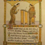
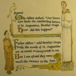
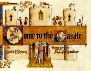
  2. What type-face or letter style looks best? Usually this is up to the art director and the publisher but on this book I want it to have an old look similar to medieval calligraphy. I also know that different fonts (letter styles) change the size and shape of blocks of text. This book has a fair amount of text for a picture book and I am planning to enclose a lot of the text  in decorative borders, so we will have to pick out the letter style before I do  finished  sketches.
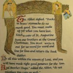
  3. What size should the letters be? The spreads that have the most text will help me pick the best size for the letters. One doesn’t usually change the size of the text from page to page .


Colored Samples

Usually I let the art director see my pacing of the text in a thumbnail dummy, which is a very small sketch version of the book . The rough drawings give the art director the idea for each page. These thumbnail drawings with text allow the art director an early opportunity to comment and direct the progress of my work before I spend a lot of time doing more finished drawings. At this stage I also include a few more finished sketches that show more clearly the style and look of the art. I pick a few pages and work them up in color.

Undivided Text

S.D. Schindler - Brother Hugo and the Bear
                            undivided text

Gayle emailed me the manuscript and I accepted the job offer. I thought the story was well written and had a nice tone. It also had lots of opportunities for humor.

The first thing an illustrator does with a new manuscript is pace it into a format of 32 pages, the usual length of a picture book. The text (manuscript) come undivided. Pacing means assigning a block of text to each page. I go back and forth on some of the text until I think it has the right flow and gives me the opportunity to illustrate what comes to mind. The art director and editor both can ask for some alternate way of dividing the text up if they don’t agree with my way.

In the Beginning

Come to the Castle, Linda Ashman & S.D. SchindlerToday I am starting my account of a book in progress. The book is a story about a monk in a monastery in France in the Middle Ages. I have been working for some time on the story already, but haven’t been ready to begin this account of my progress until now.

I first heard from the art director, Gayle Brown, in July of 2011. She had this manuscript and thought I might be right to do the illustrations. She’d seen other picture books I had done, in particular, Come to the Castle by Linda Ashman.