From the start I have to decide on three things:
- What shape should the page be? How high or wide should it be? I have generally liked a more horizontal shape, such as 9″ high by 11″ wide.
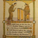
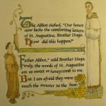
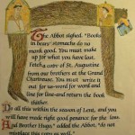
- What type-face or letter style looks best? Usually this is up to the art director and the publisher but on this book I want it to have an old look similar to medieval calligraphy. I also know that different fonts (letter styles) change the size and shape of blocks of text. This book has a fair amount of text for a picture book and I am planning to enclose a lot of the text in decorative borders, so we will have to pick out the letter style before I do finished sketches.
- What size should the letters be? The spreads that have the most text will help me pick the best size for the letters. One doesn’t usually change the size of the text from page to page .


