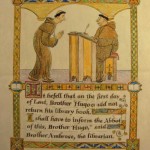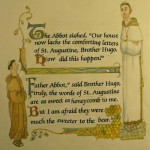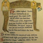
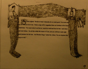
 This is the first full spread. There are no boxed scenes here. Page two uses the figures of Hugo and the Abbott to enclose the text with a fanciful banner on the bottom. The bear itself is the border on page three. People and Animals were often portrayed in medieval books distorted into the shapes of numbers or letters.
Monthly Archives: June 2014
Thumbnails-2
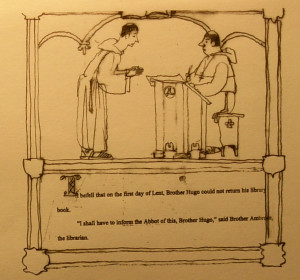
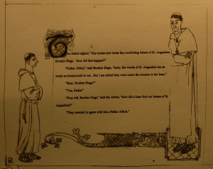
The first page of the story is not a spread- it starts on the right hand page of the first spread. The sketch shows how I will be enclosing the text and a scene in a decorative border. The taped-in text is too small for the box but that is easily corrected later. I also show how each new paragraph would start with a larger decorated letter.
Thumbnails-1
The text has been divided into a 32 page format and now I work up sketches for each spread. I photocopy the text and cut it up and then tape it onto a mini version of the spread size. I am using a dimension of about 4″ high by 5 1/4″ long for each page. So each spread is 4″ high by 10 1/2″ long.
Early Decisions
From the start I have to decide on three things:
- What shape should the page be? How high or wide should it be? I have generally liked a more horizontal shape, such as 9″ high by 11″ wide.
- What type-face or letter style looks best? Usually this is up to the art director and the publisher but on this book I want it to have an old look similar to medieval calligraphy. I also know that different fonts (letter styles) change the size and shape of blocks of text. This book has a fair amount of text for a picture book and I am planning to enclose a lot of the text in decorative borders, so we will have to pick out the letter style before I do finished sketches.
- What size should the letters be? The spreads that have the most text will help me pick the best size for the letters. One doesn’t usually change the size of the text from page to page .
Colored Samples
Usually I let the art director see my pacing of the text in a thumbnail dummy, which is a very small sketch version of the book . The rough drawings give the art director the idea for each page. These thumbnail drawings with text allow the art director an early opportunity to comment and direct the progress of my work before I spend a lot of time doing more finished drawings. At this stage I also include a few more finished sketches that show more clearly the style and look of the art. I pick a few pages and work them up in color.
