The sketches are done for the story and have been approved. Next I draw the sketches on the paper I have chosen for the finished art. I draw them out in pencil and clean them up so they are virtually the line to be inked in. I copy the sketches and give the publisher one more look at them for changes. After I ink them in it will be hard to change them. After the go ahead from the art director I ink them in and then erase the pencil line where necessary. After the inking, I apply the washes and then the art is done. The slideshow shows each spread at the rough sketch stage and then the inked in stage and then the finished art stage. (Click on small box at bottom right corner of video to view full-screen.)
A Different Direction- Vertical
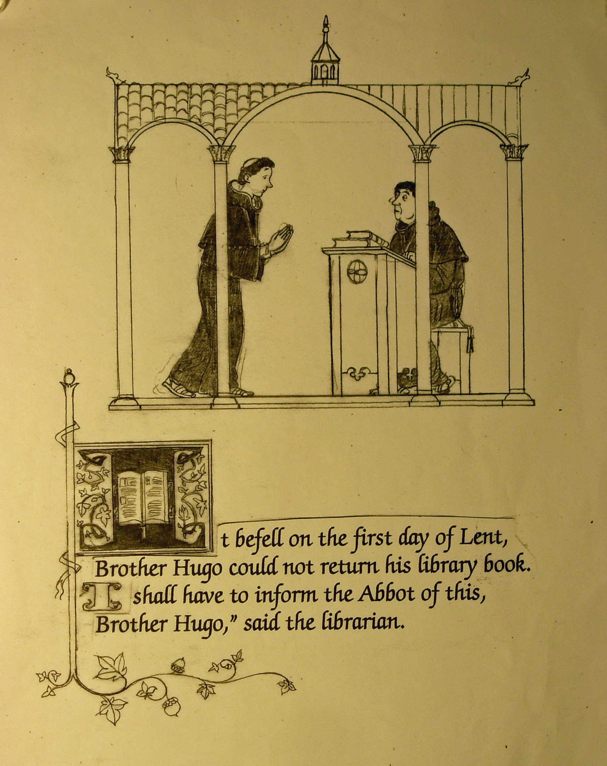
I now have finish sketches for the story. I am still wondering about trying the book using a different page dimension. Each completed sketch is on a page 8″ high by 10″ wide. Now I want to see how each sketch would look like on a page 10″ high by 8″ wide. My previous medieval book was horizontal as are the completed sketches.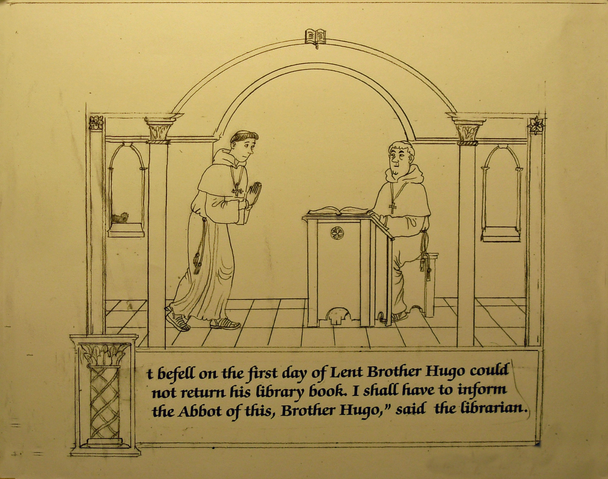
pg 1 in the 8″h x 10″w format.
 Two slightly different designs in the vertical format. ( all pg 1)
pg 1 (above) A different idea. The design is like several other pages in the book. I like it better than the other two. It works better on the taller page too.
pg 2 (above)


pg 3 (above)

pg 4 (above)
 pg 5 (above)

pg 6 (above)
pg 7 (above)
The next six pages show that little has to be done to modify the sketches to a more vertical page dimension. I still like the look of most of the horizontal page sketches. I will send off both sketch versions and let the publisher decide. The other thing that still needs to be decided is the font style. These sketches are designed using a few different styles. Once I have the chosen font, then I will be able to fix the size and shape of each text block accurately.
8″ h x 10″ w Finish Sketches, Continued
pp 14-15.
 pp 14-15. Page 15 has a little different design because some text will be booted into the next spread.
pp 16-17.
 pp 16-17. New text from page 15 made some changes necessary. Now there are three vignettes on page 16.
pp 18-19.

 pp 18-19. No changes. Well, the big A on pg. 19 has a different style.
pp 20-21.

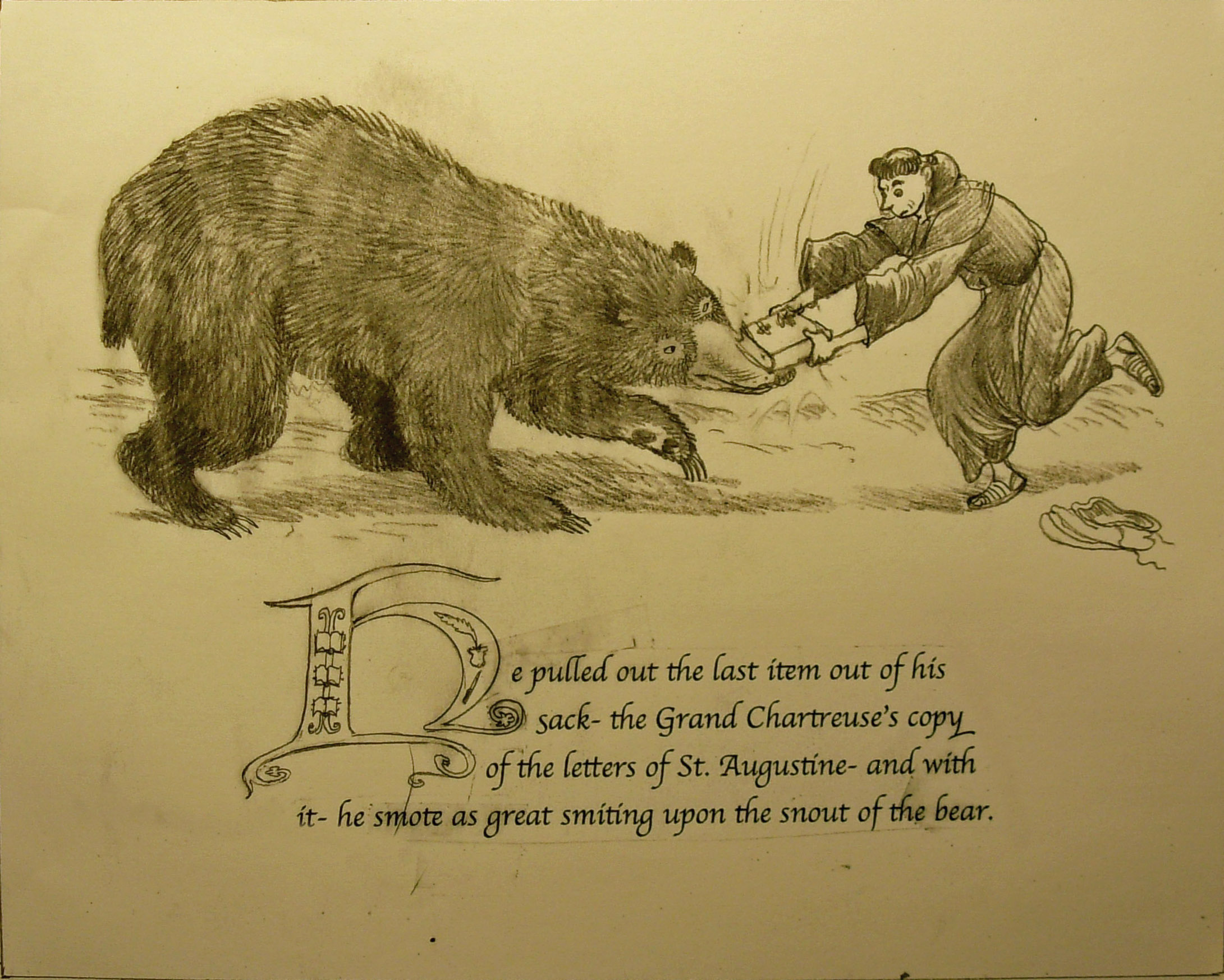
 pp 20-21. I moved some of the text on page 20 from the top box to the bottom box. The big T on page 21 thumbnail is now an A. I’m not sure why I drew a T for that box…

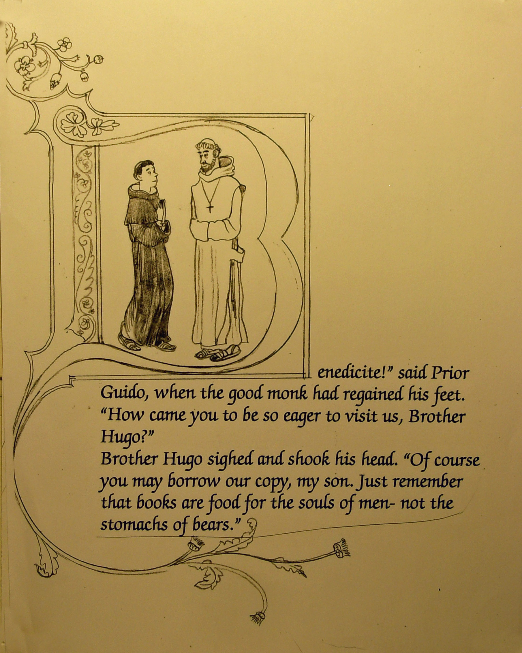
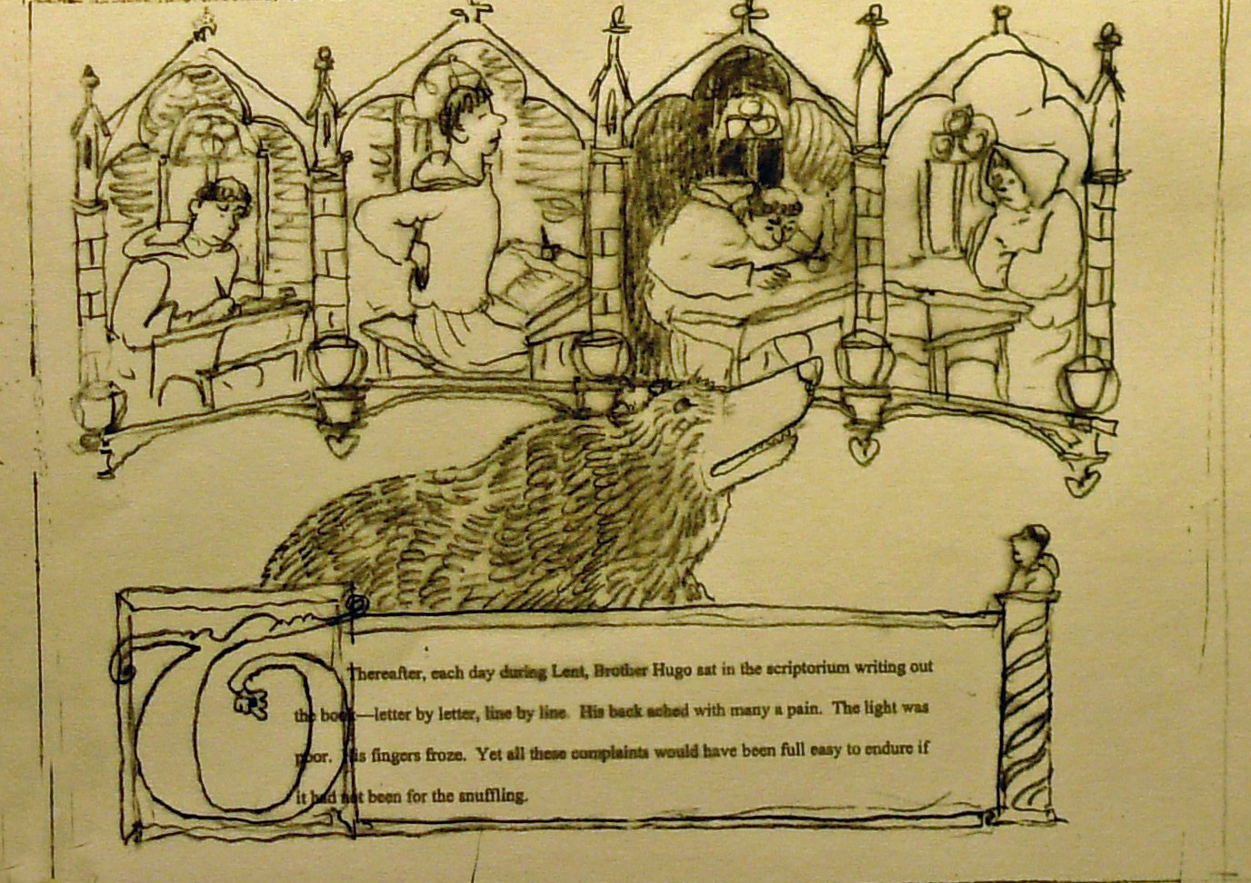
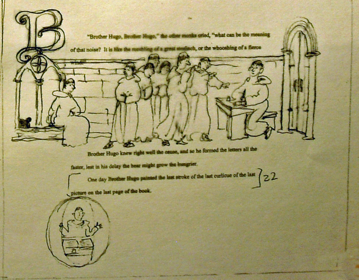
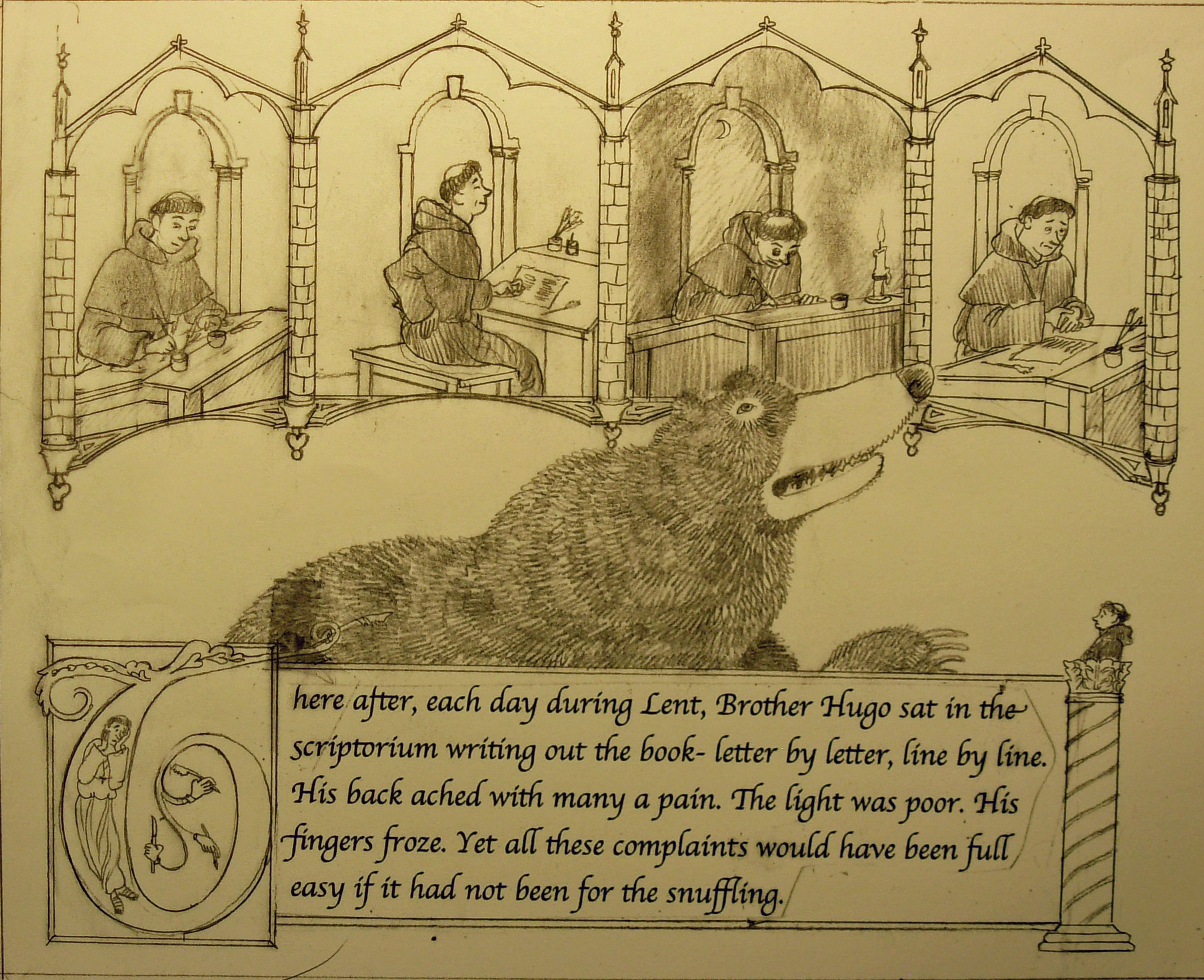
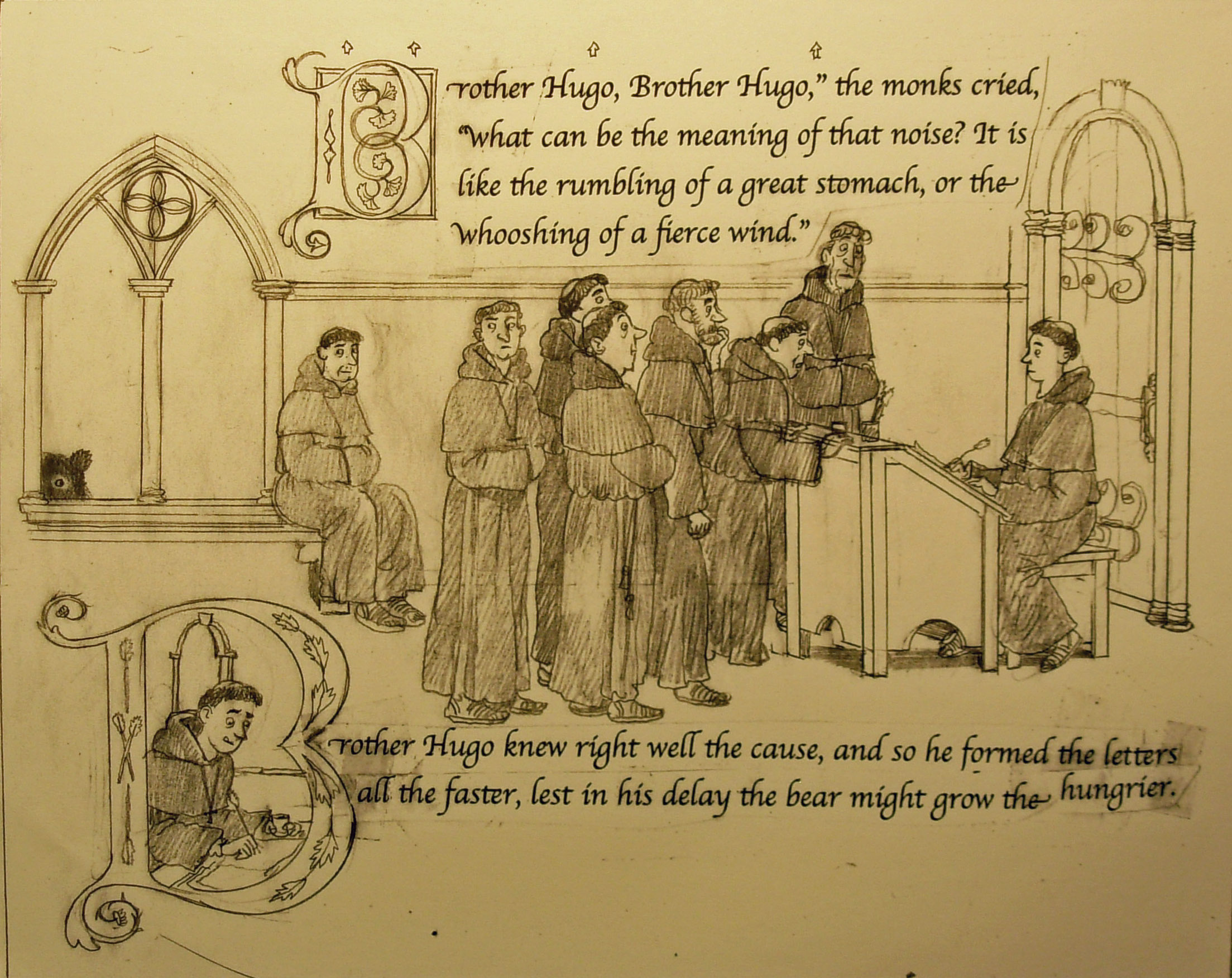
pp 22-23.
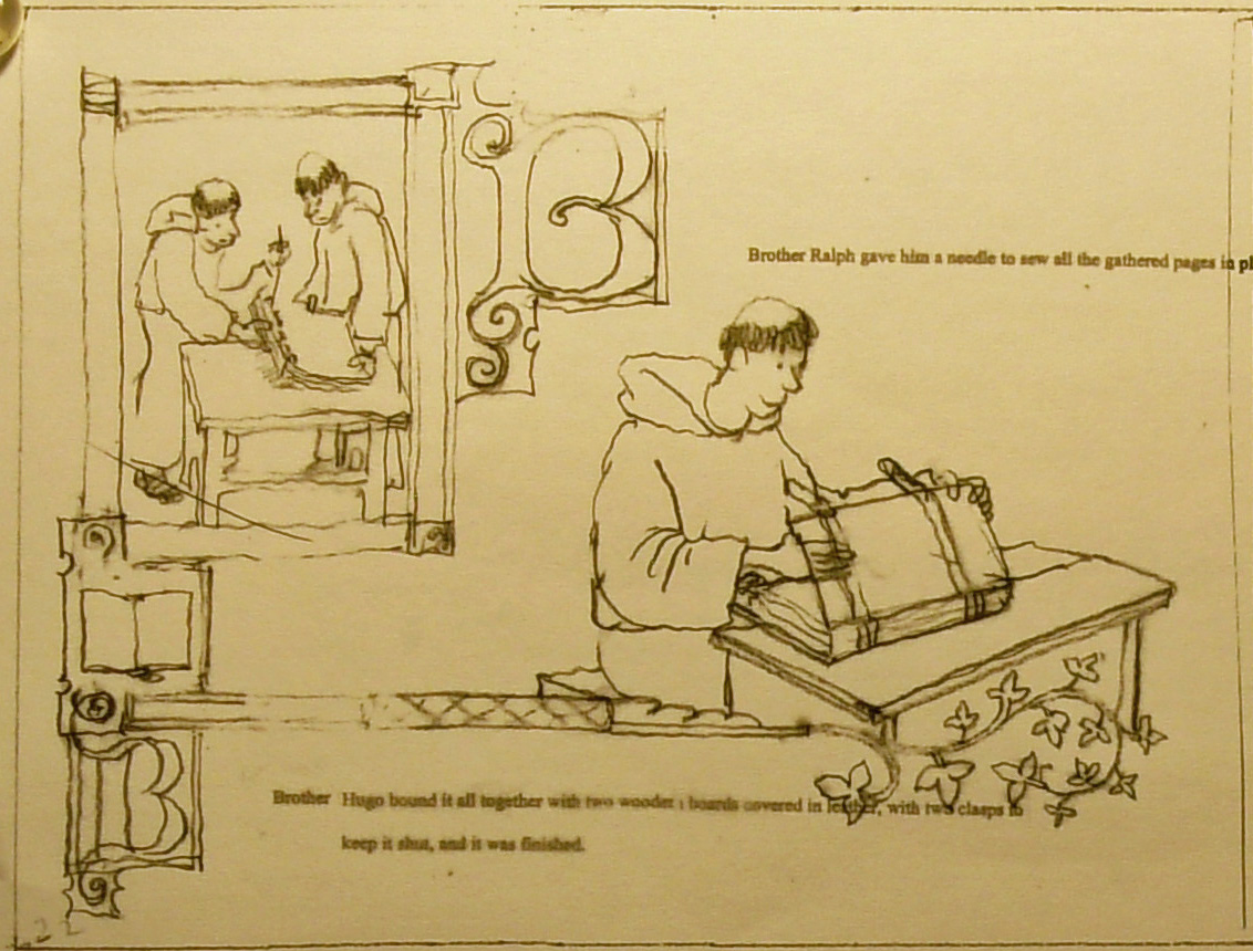
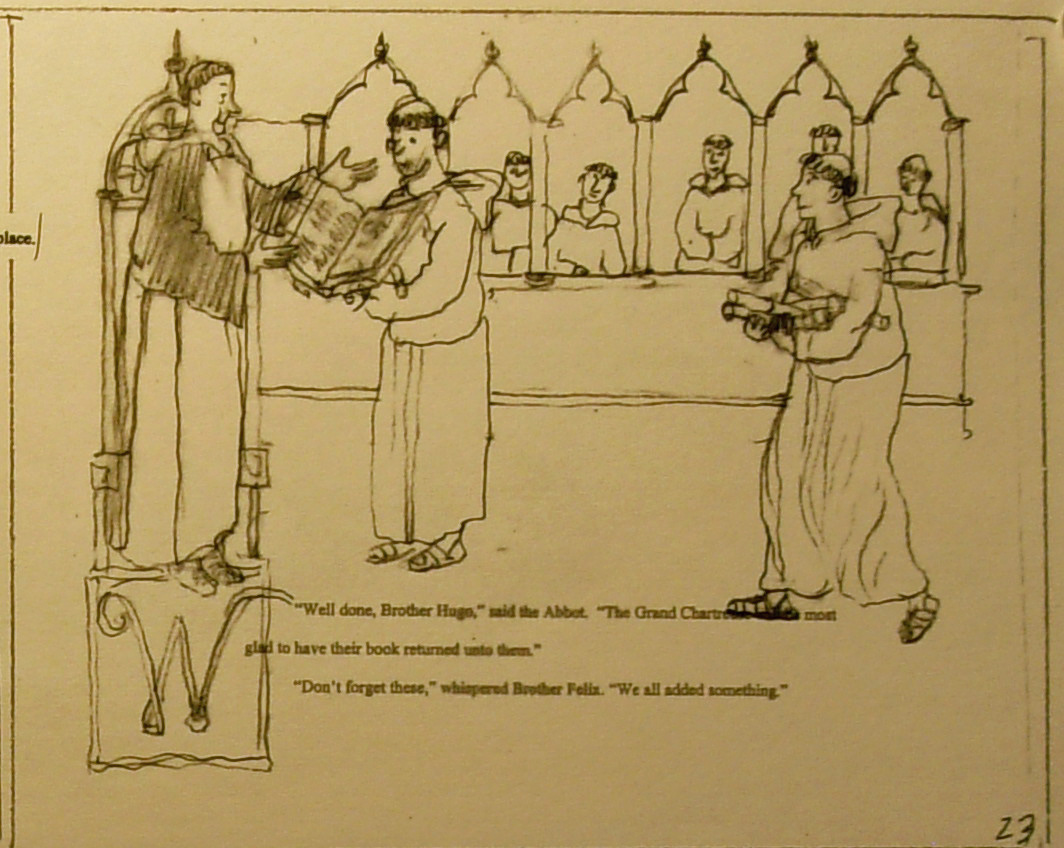
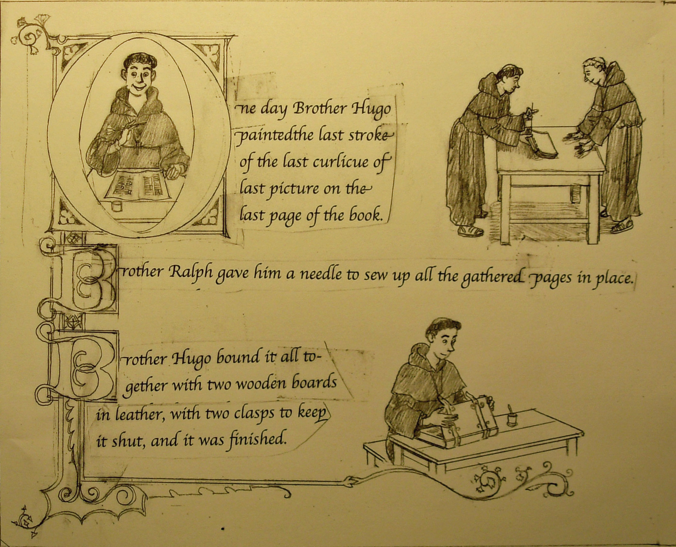
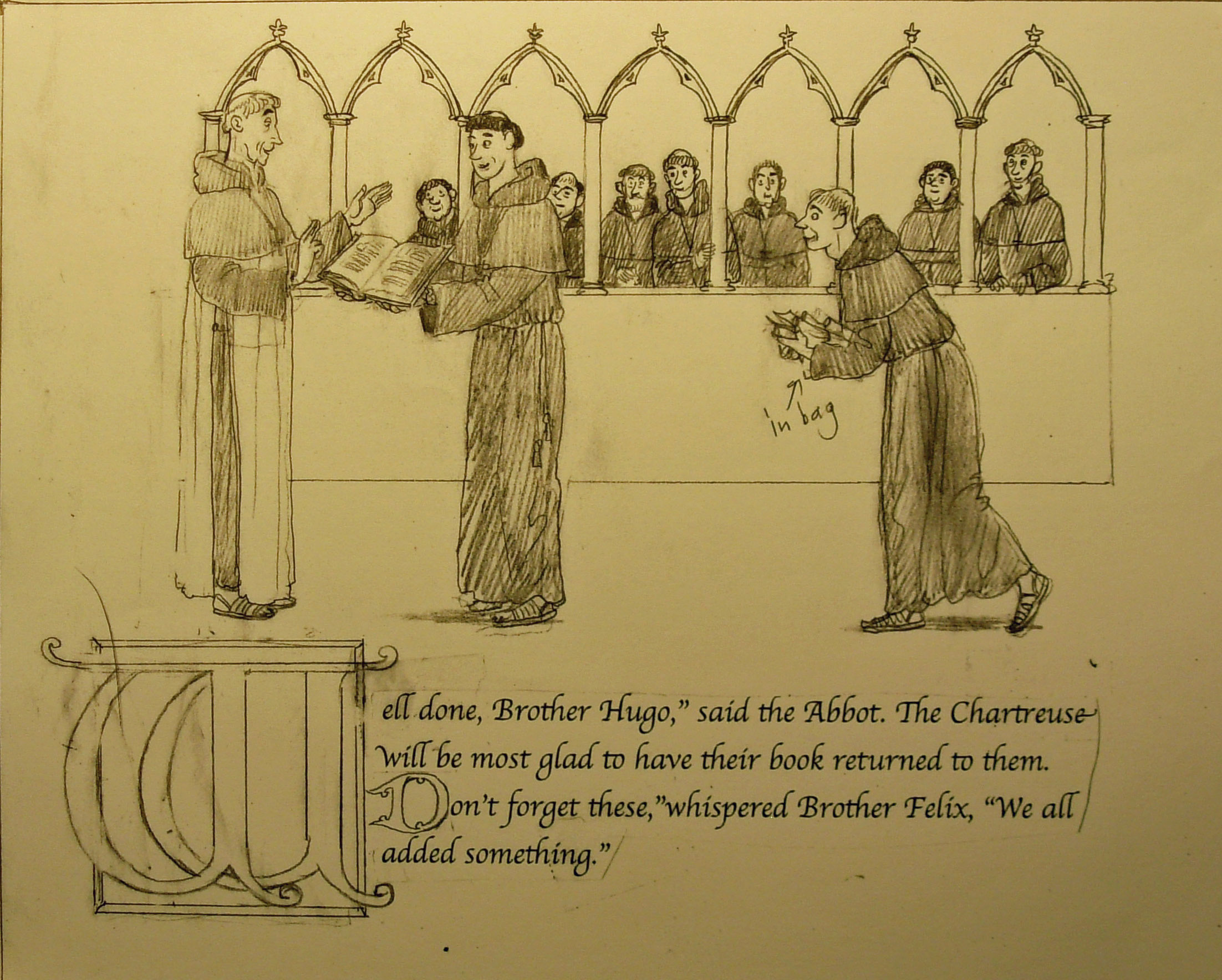
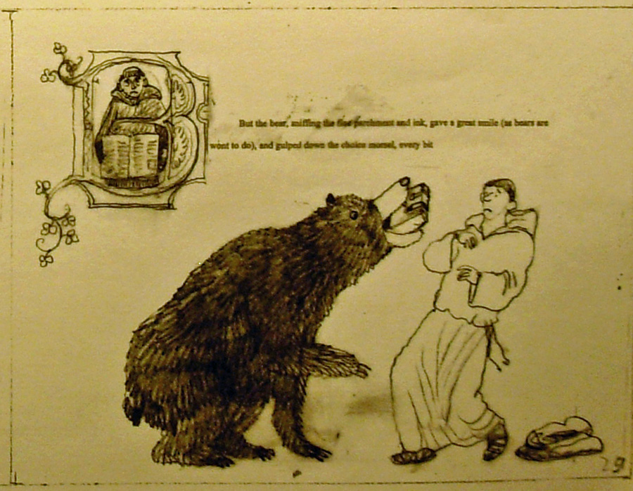
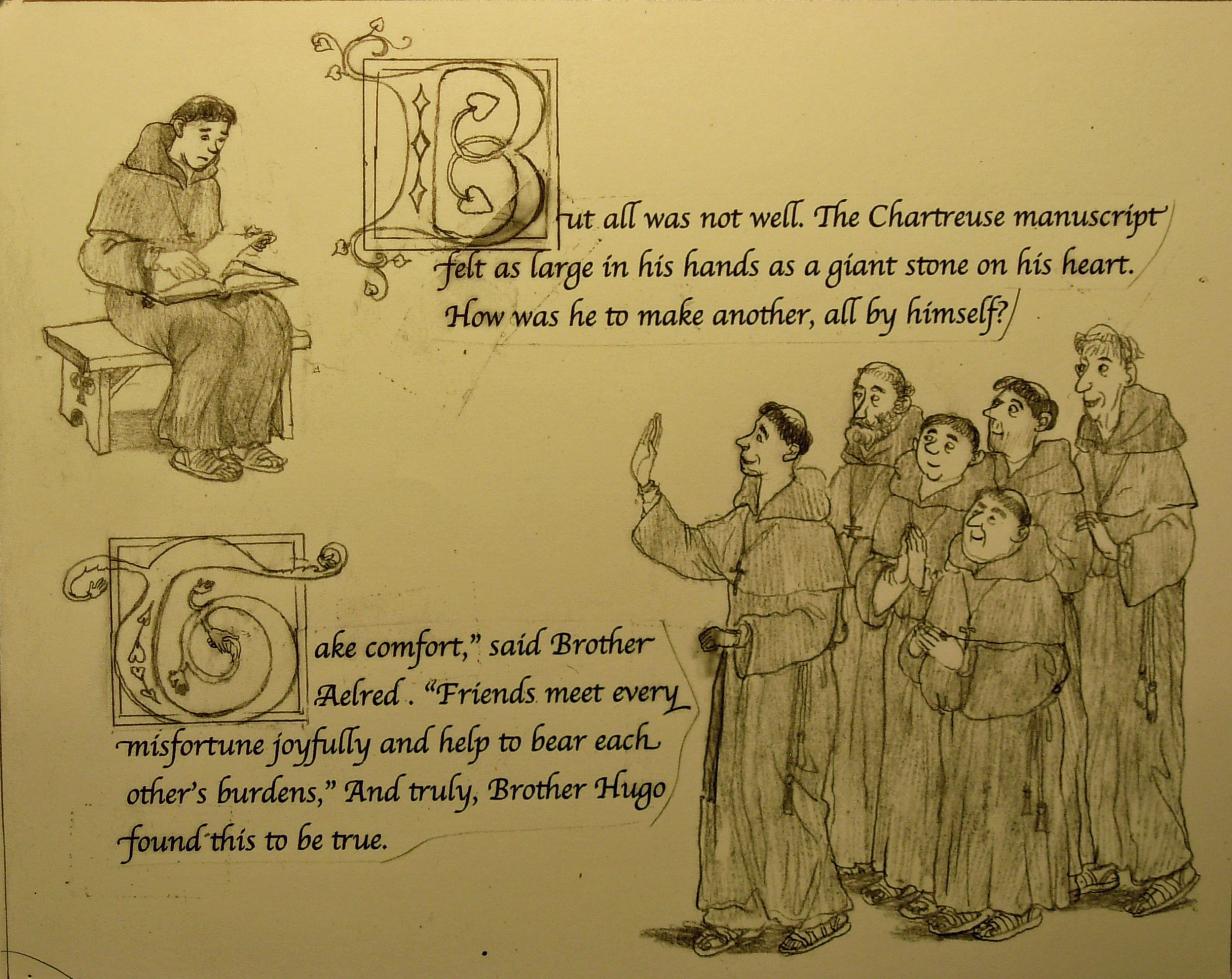
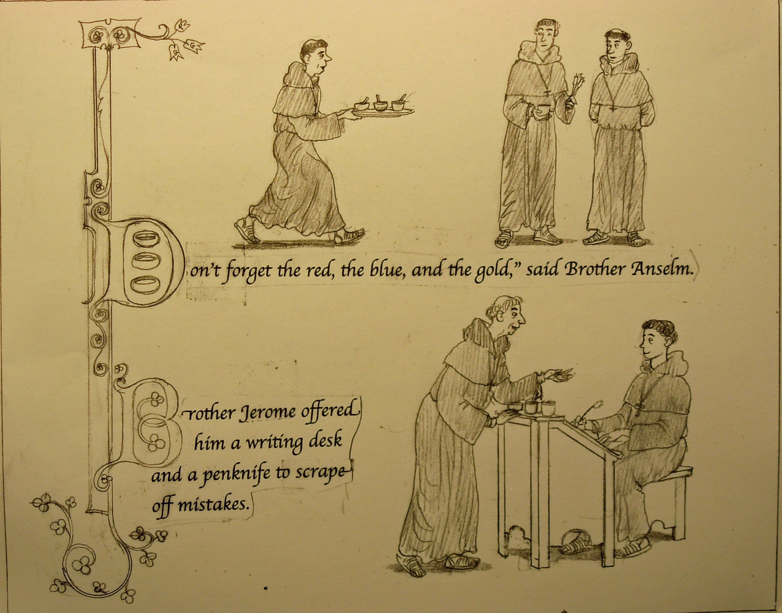
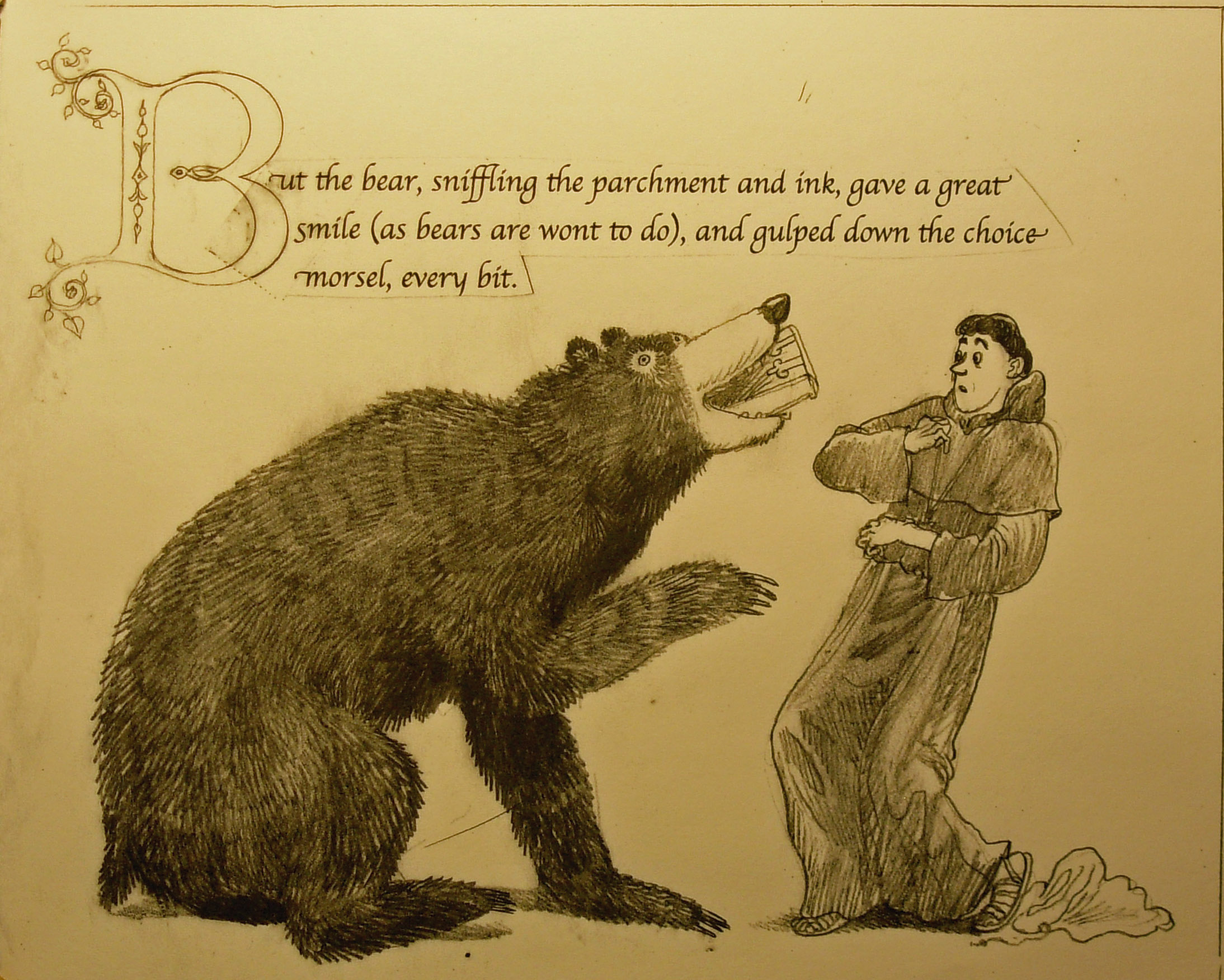 pp 22-23. I took the monk out of the big B on page 23. I am not sure what I was thinking there.

pg 24.
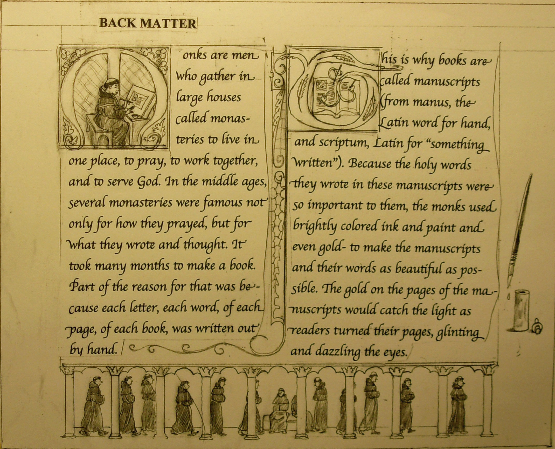
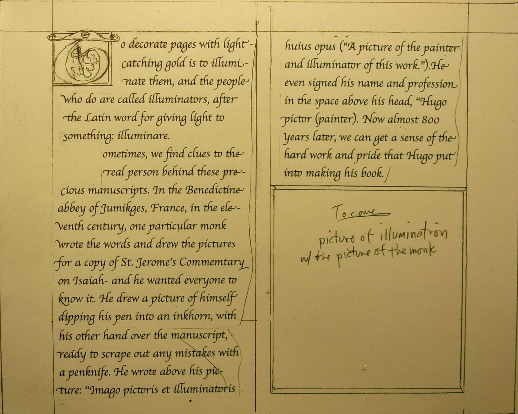
pg 24. No changes. The rest of the pages are for historical notes, author and illustrator notes and maybe some other things…
pg 25
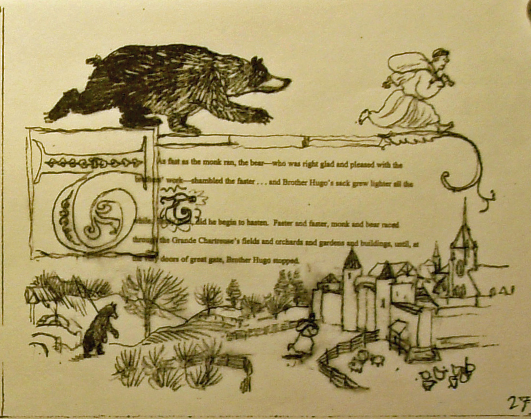
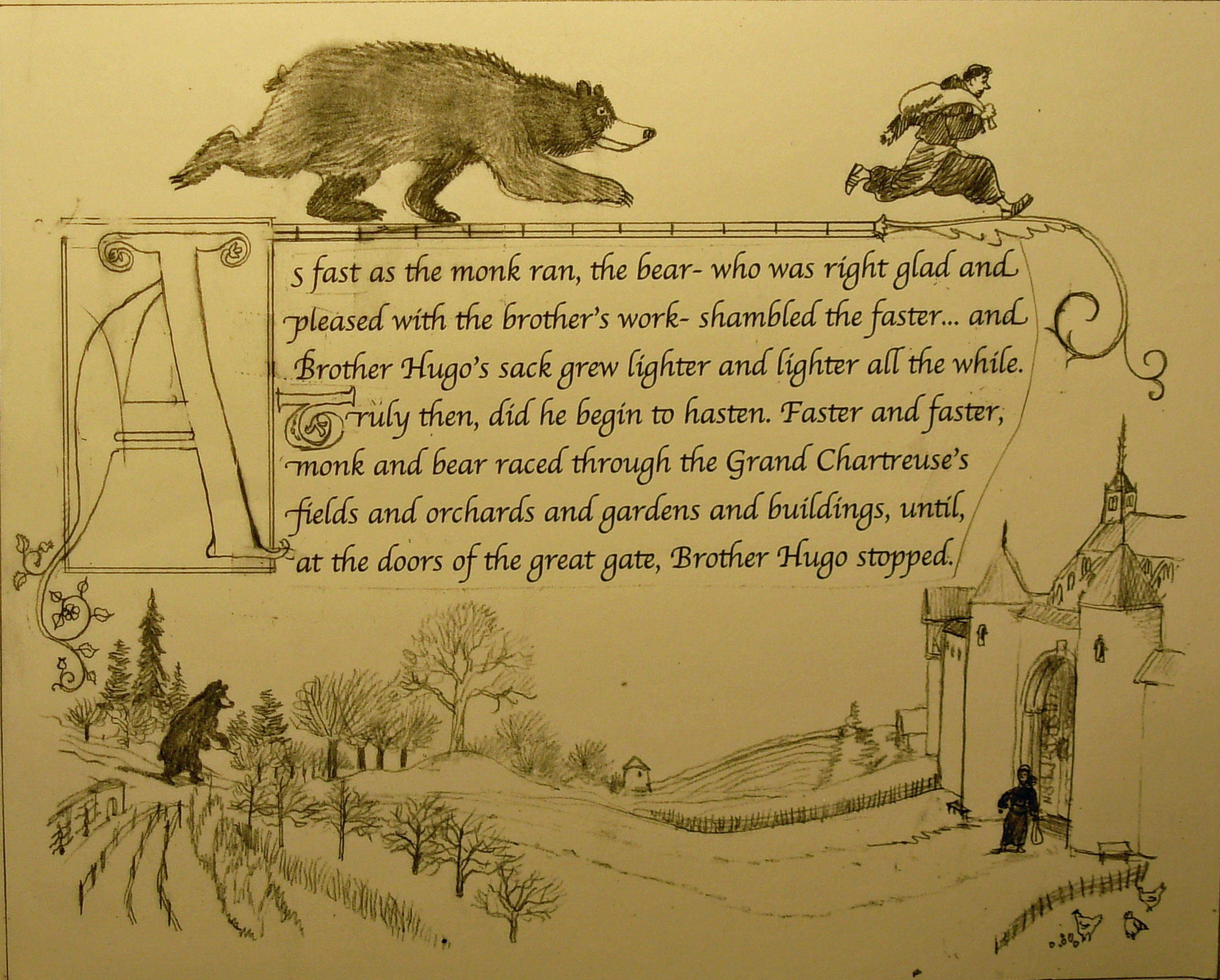
 pp 26-27.
pg 28. These back matter pages have two columns of text per page. They mimic the design of many medieval books.
8″ x 10″ Finish Sketches, Continued

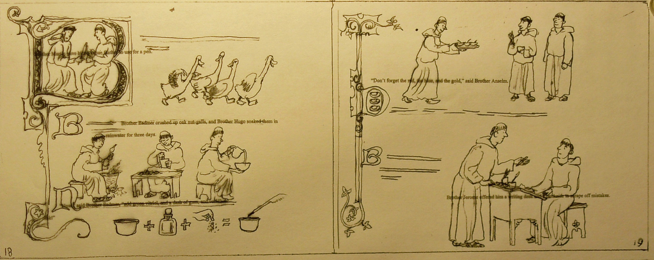
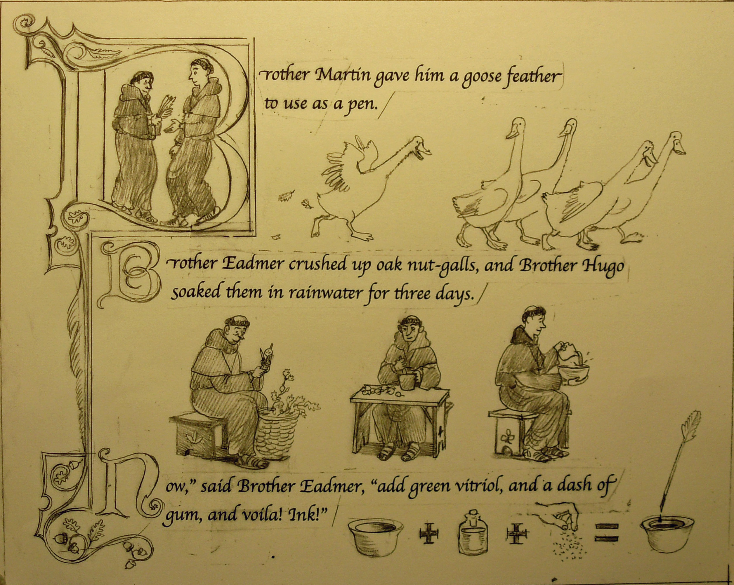
pp 8-9
 pp 8-9. No changes here.

pp 10-11.
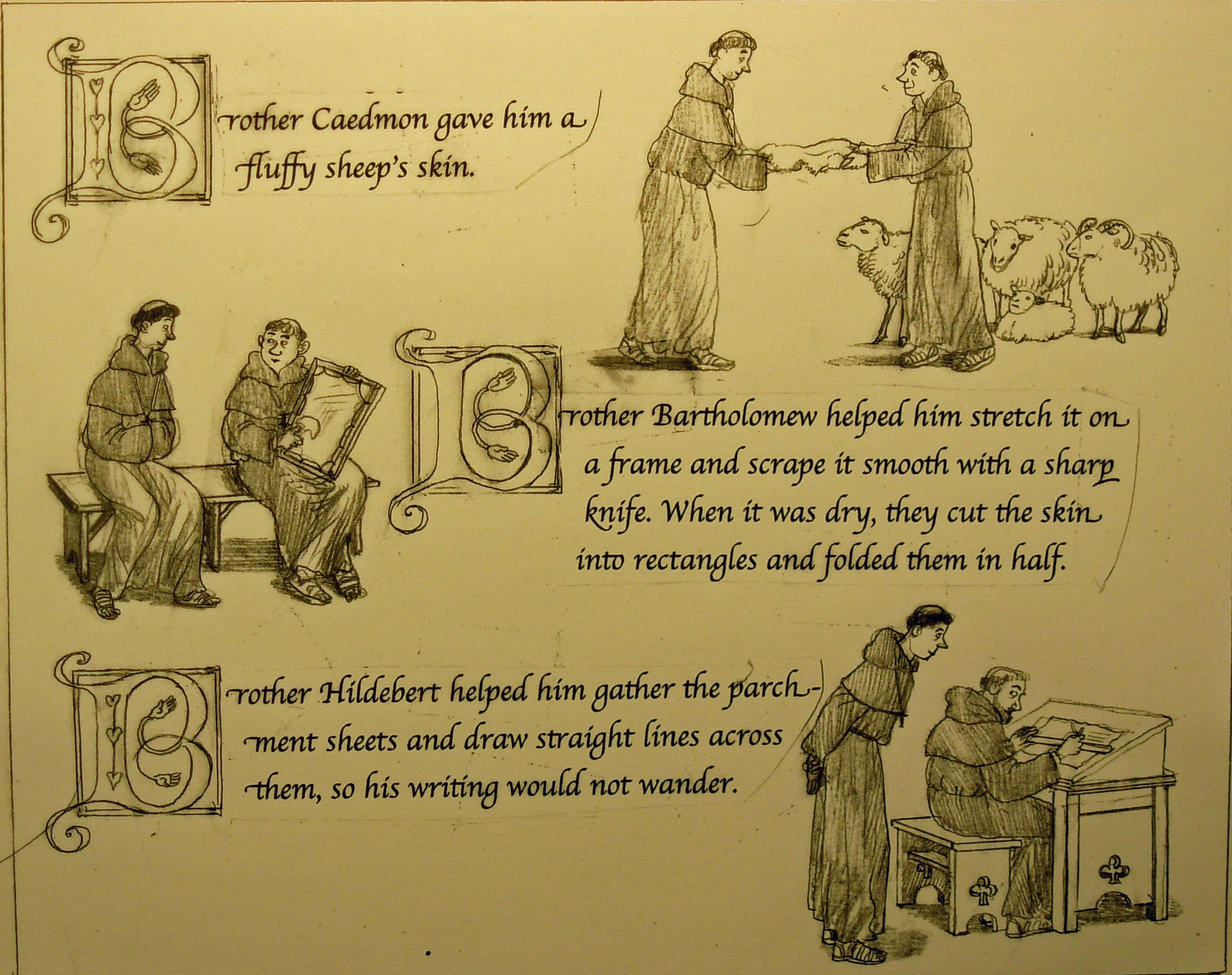 pp 10-11. Page 10 has six monks now instead of three. The first block of text I moved to the top of 10.
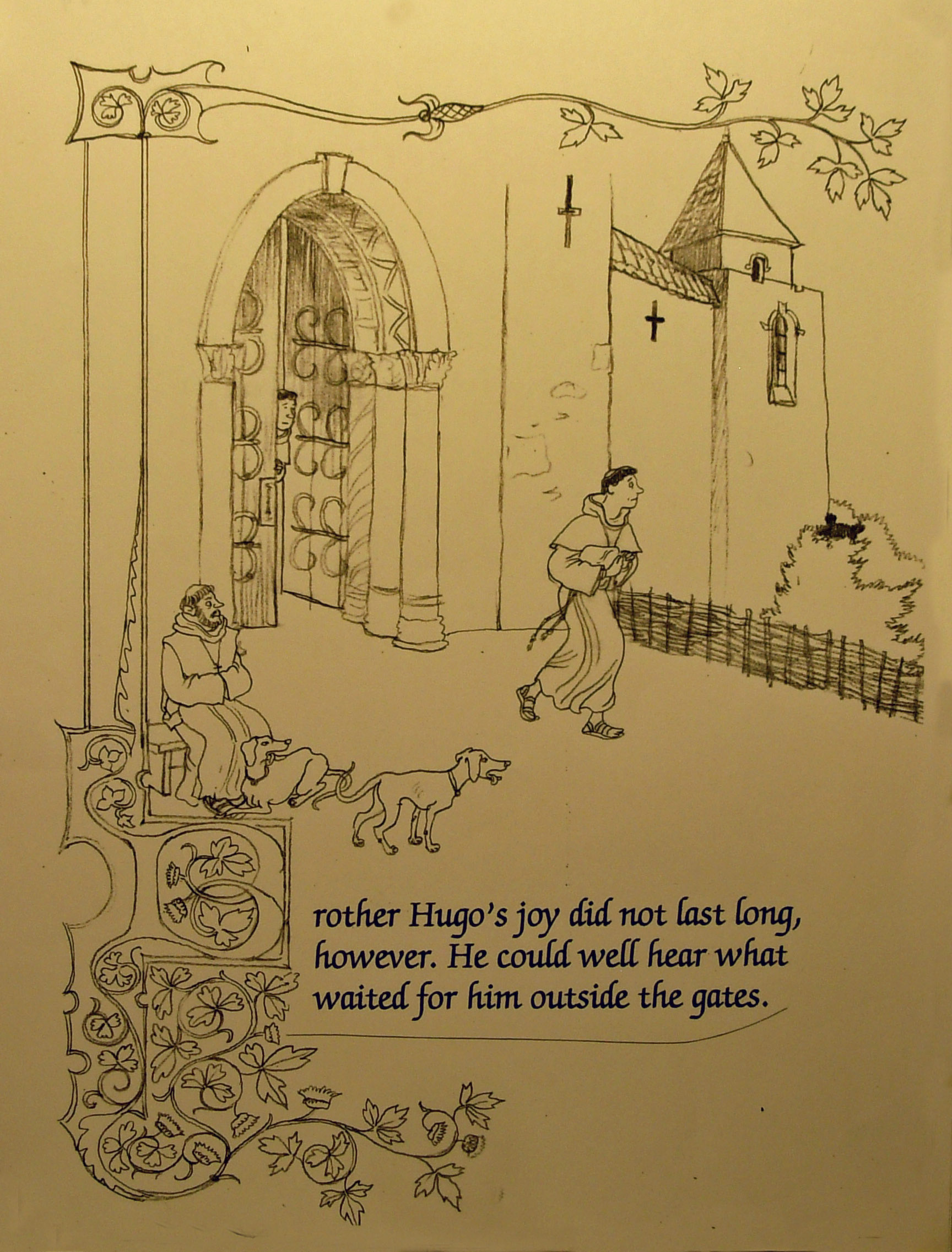
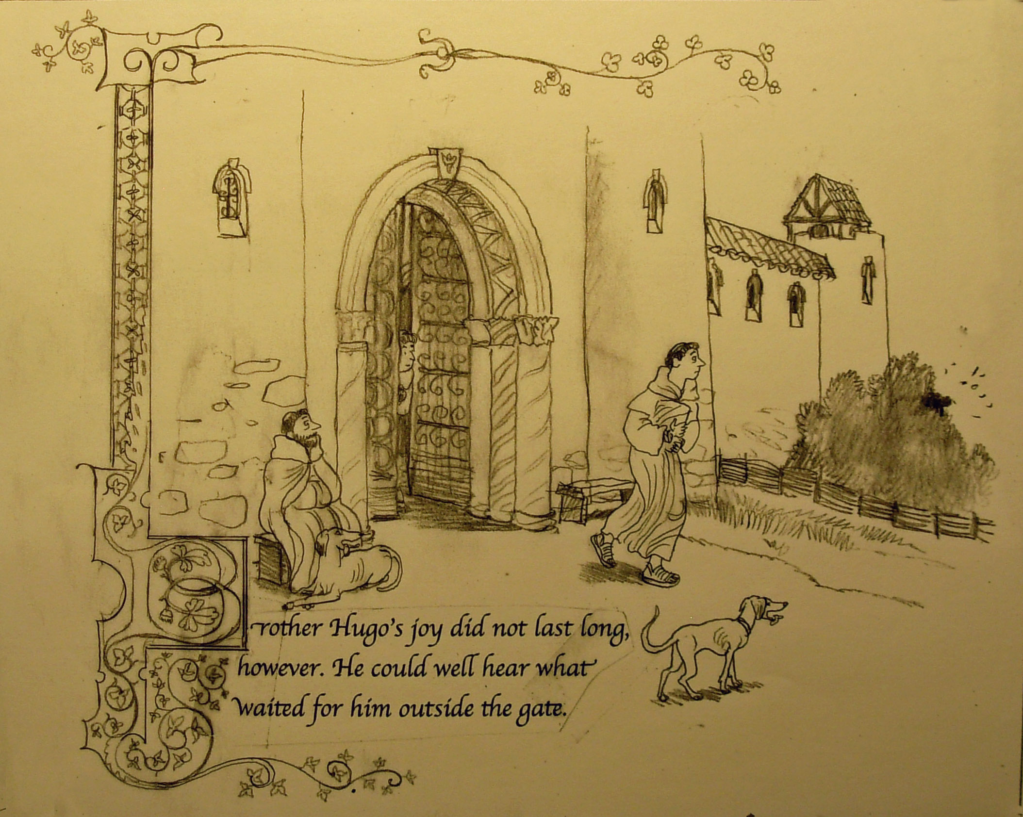
pp 12-13.
 pp. 12-13. No changes here.
8″ h x 10″ w Finish Sketches, Continued
pp 4-5
pp 4-5. Page 4 has the text broken into three blocks instead of two, as in the thumbnail. The text on page 5 is split into two columns instead of one wide one.
pp 6-7
pp6-7. Rearranged vertical banner on page 7.
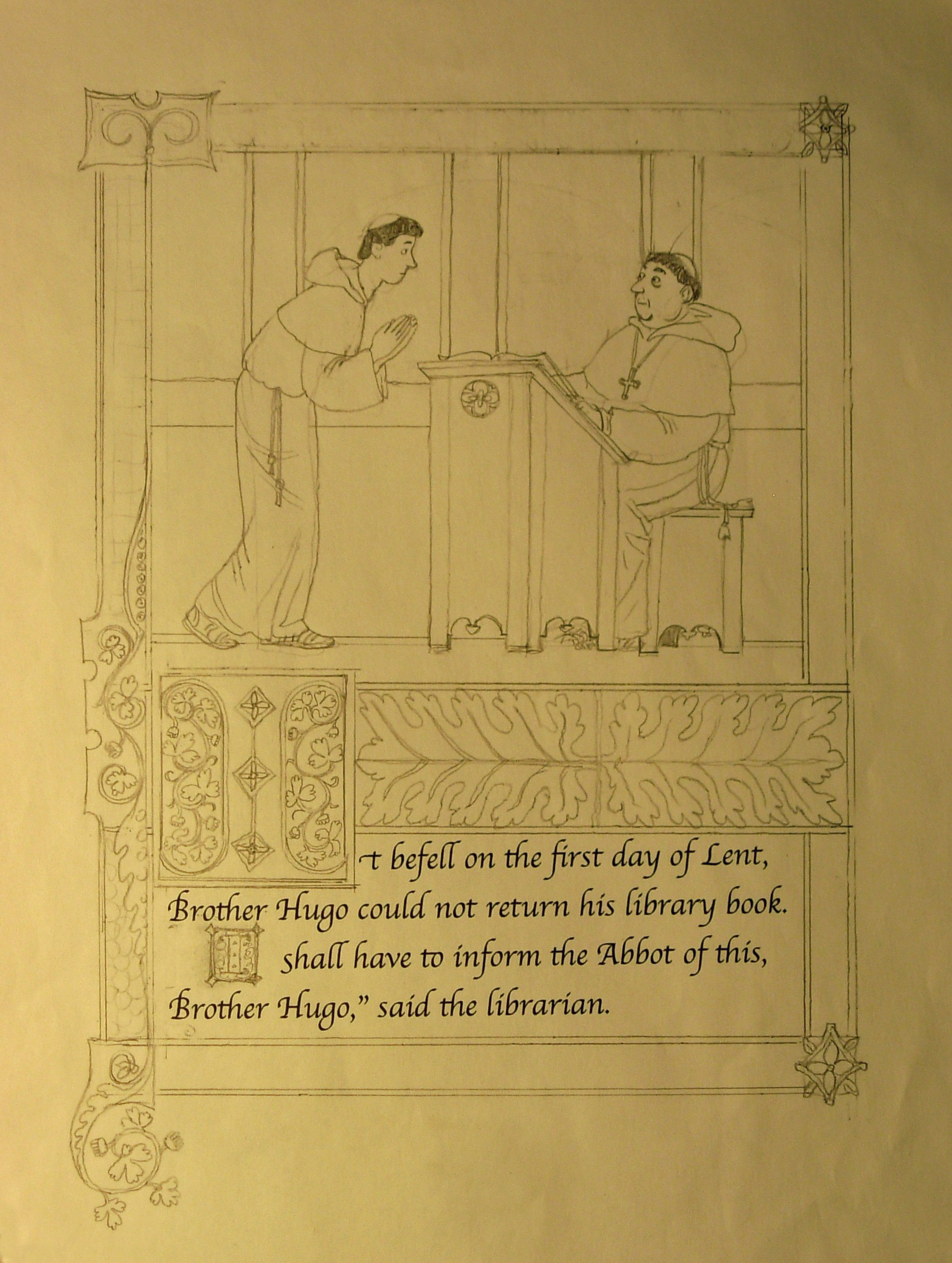
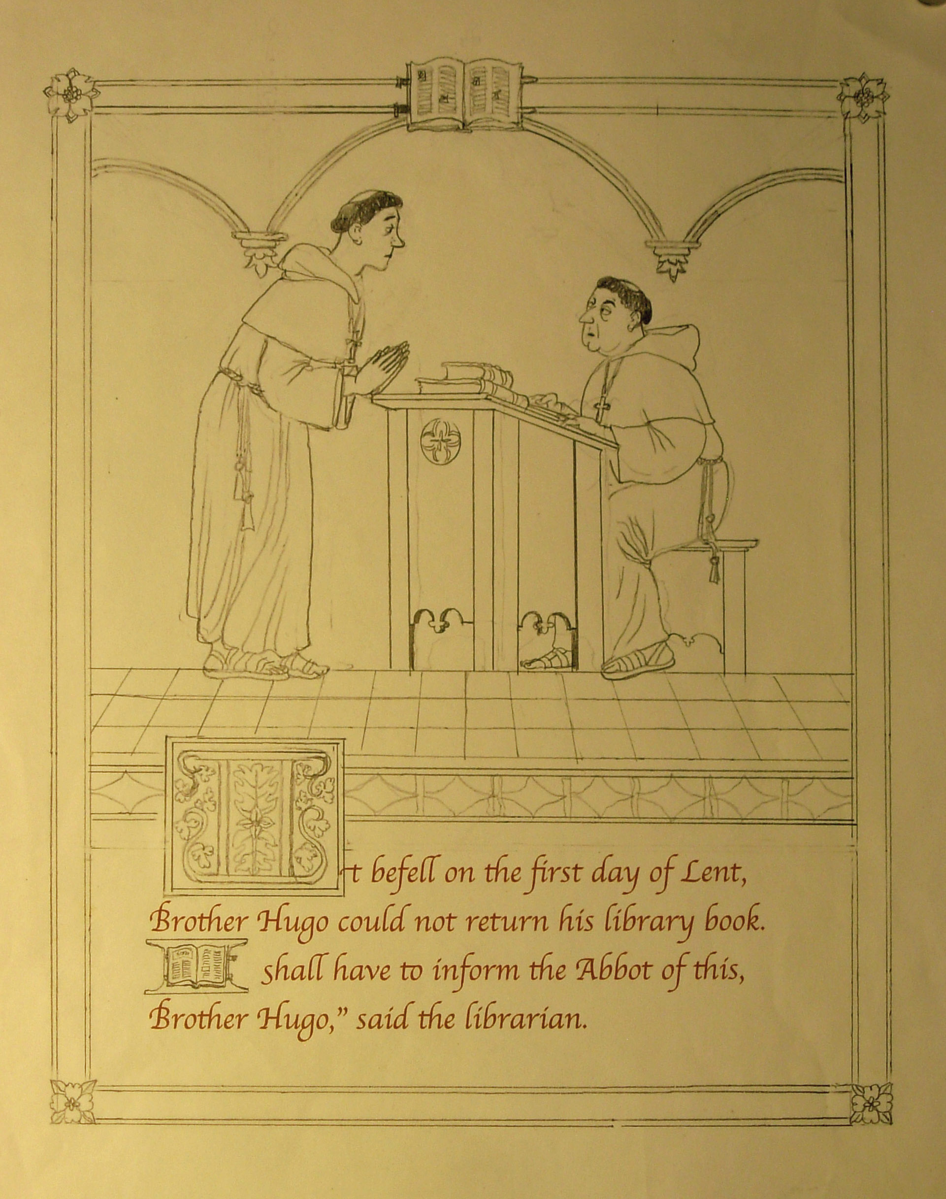
8″h x 10″w Finish Sketches
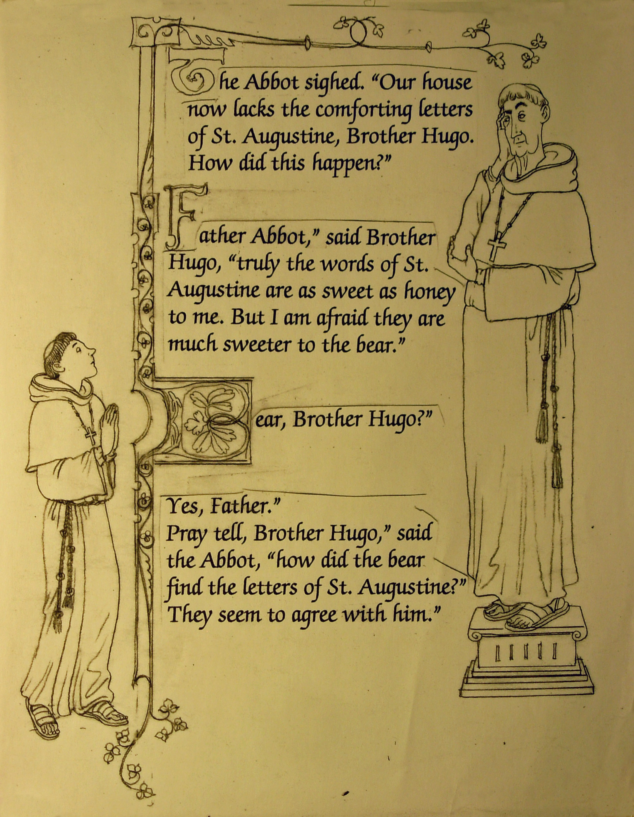
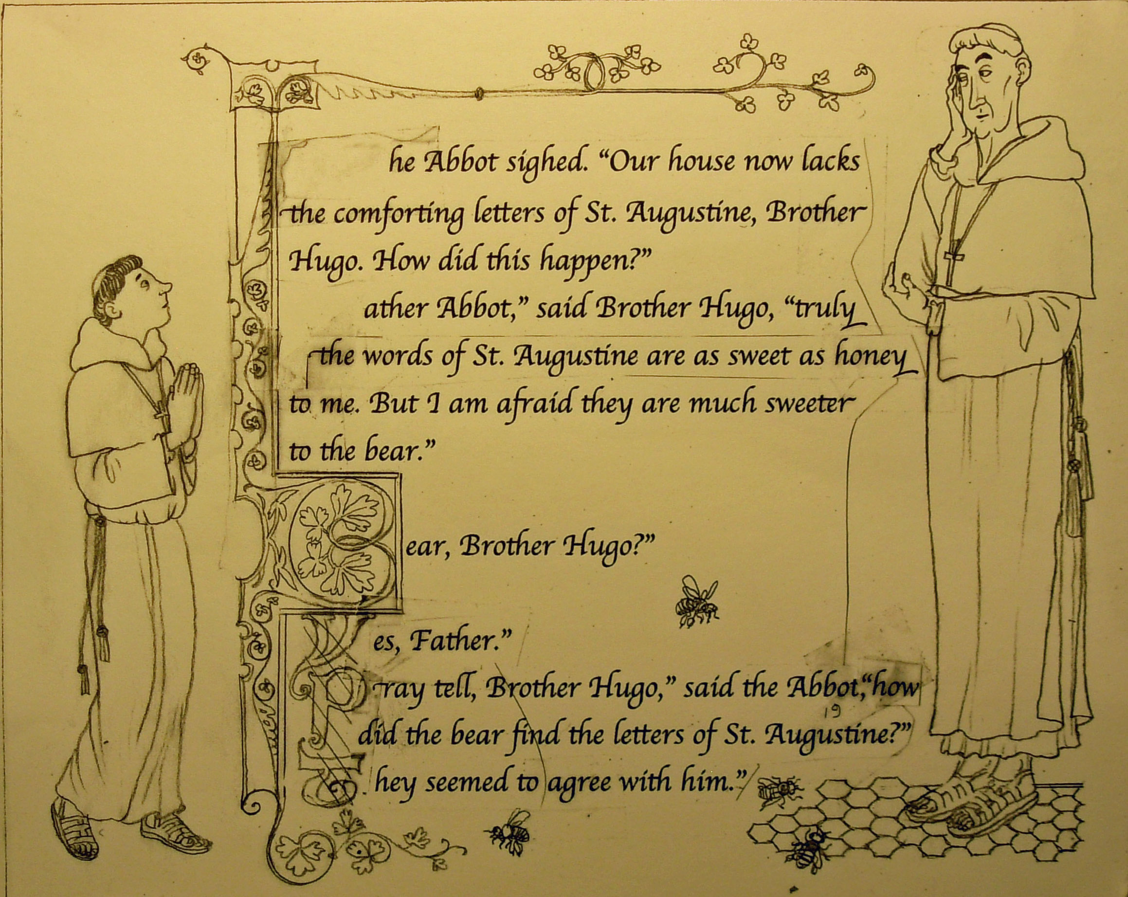
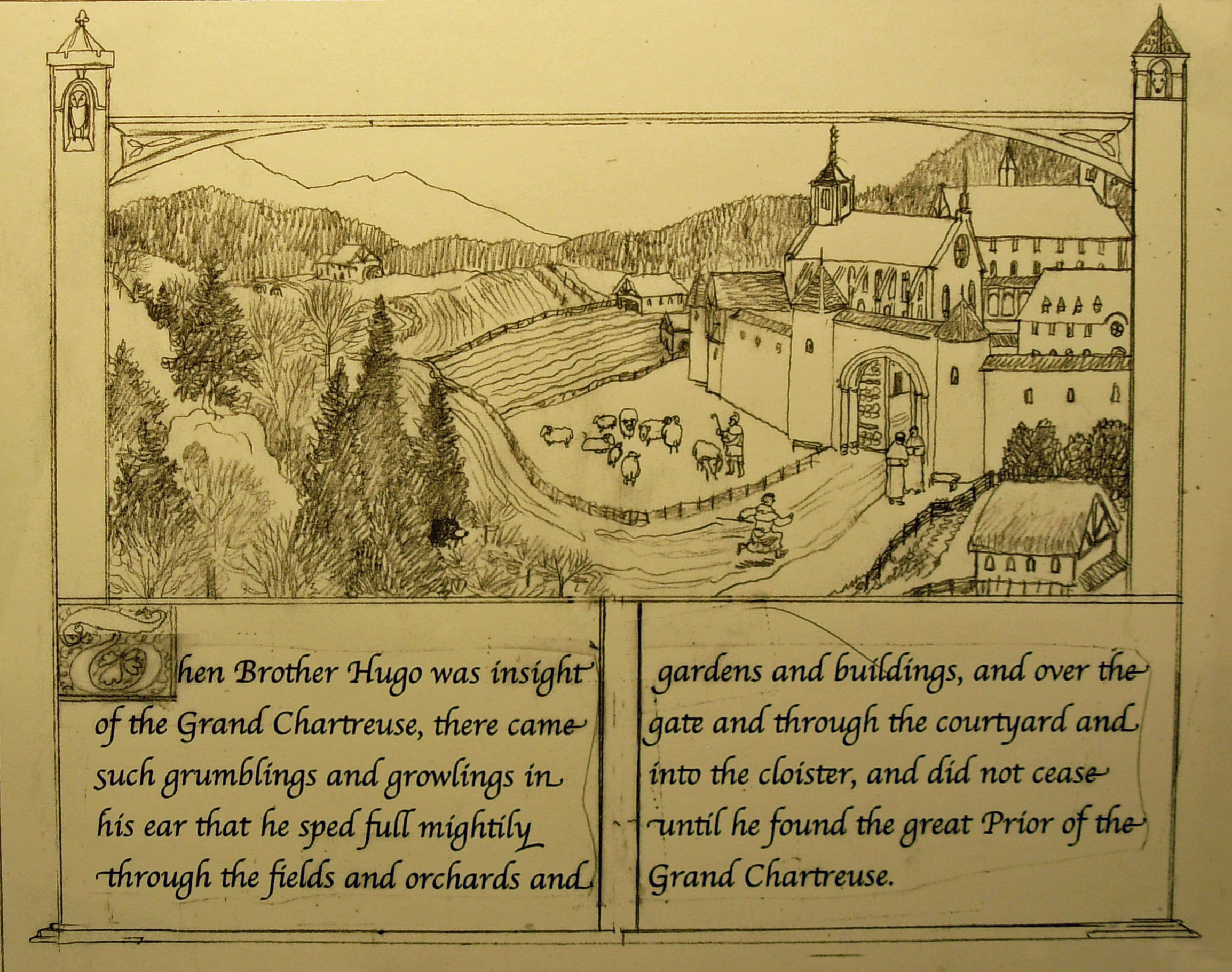
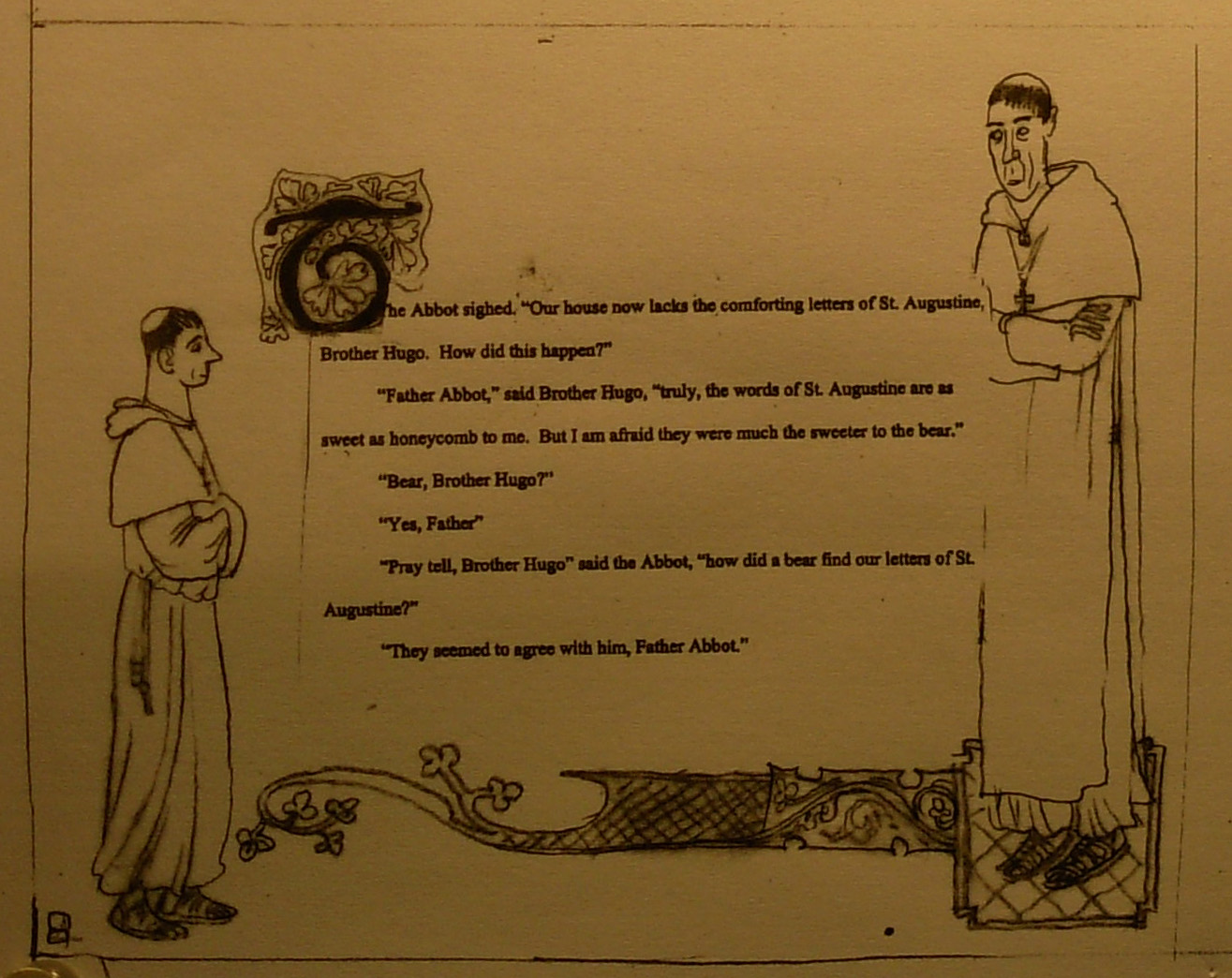
pg 1- This page has a new design for the box- an arch and two side windows. The font for these sketches is Apple Chancery.

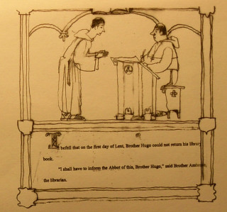
pp 2-3.Page 2 has a floor of honeycomb added under the Abbot’s feet and some buzzing bees. On page 3, I made the windows more elaborate.
Who is Hugo?
While I wait to hear from my art director about the thumbnails, I can begin to think about the main character of the book, brother Hugo. What will he look like? How old is he? Is he tall or short, thin or fat? While working up some of the sketches for the samples, I try a few different looks. In one he is a tall, slightly heavy man in his 4o’s. In another he is a young man with a boyish face. None of them seemed quite right.
My wife and I were invited to a fourth of July picnic and there I “met” Hugo. He was the son of our hosts, visiting with his wife and little girl. I had met him before , but hadn’t seen him in years. He is tall and quite thin with very angular facial features. The minute I saw him I thought, “This guy looks like a monk- he could be Hugo”. With him as a model, I began filling in a back story ( Hugo was new to the monastery. He was intelligent. He was maybe a bit of a dreamer or looked that way because he never got enough sleep with all the religious services to attend and chores to perform. The meals perhaps were a bit low in calories and nutrients). Any way, when I got back home after the picnic I sketched a headshot of him on my magic slate. A magic slate is a product I have used for years, going back to my childhood. It is a cardboard pad with a waxy, dark upper surface. On top of that is attached a thin pale gray sheet of acetate. On top of that is attached a thicker sheet of clear acetate. Using a plastic stylus, one can draw pictures and then erase them by lifting the sheets.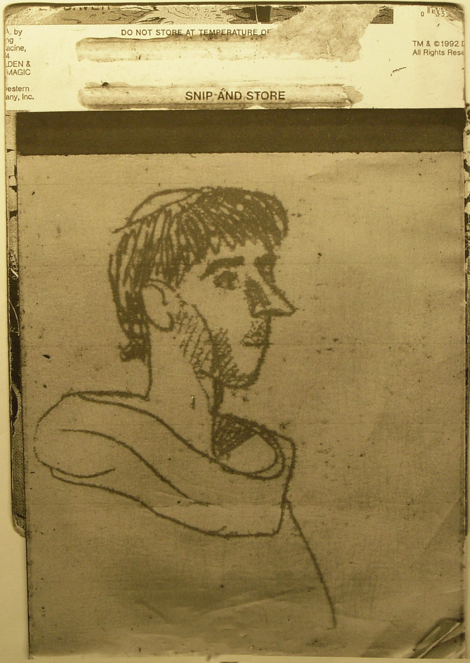
I was pretty satisfied that this would be Hugo. I did some additional sketches…

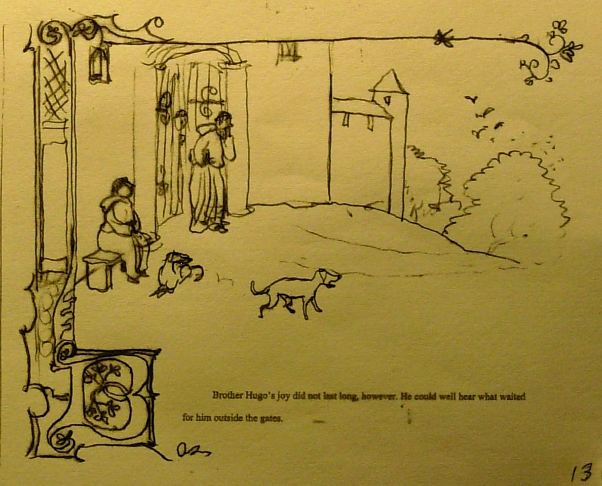
Thumbnails-13
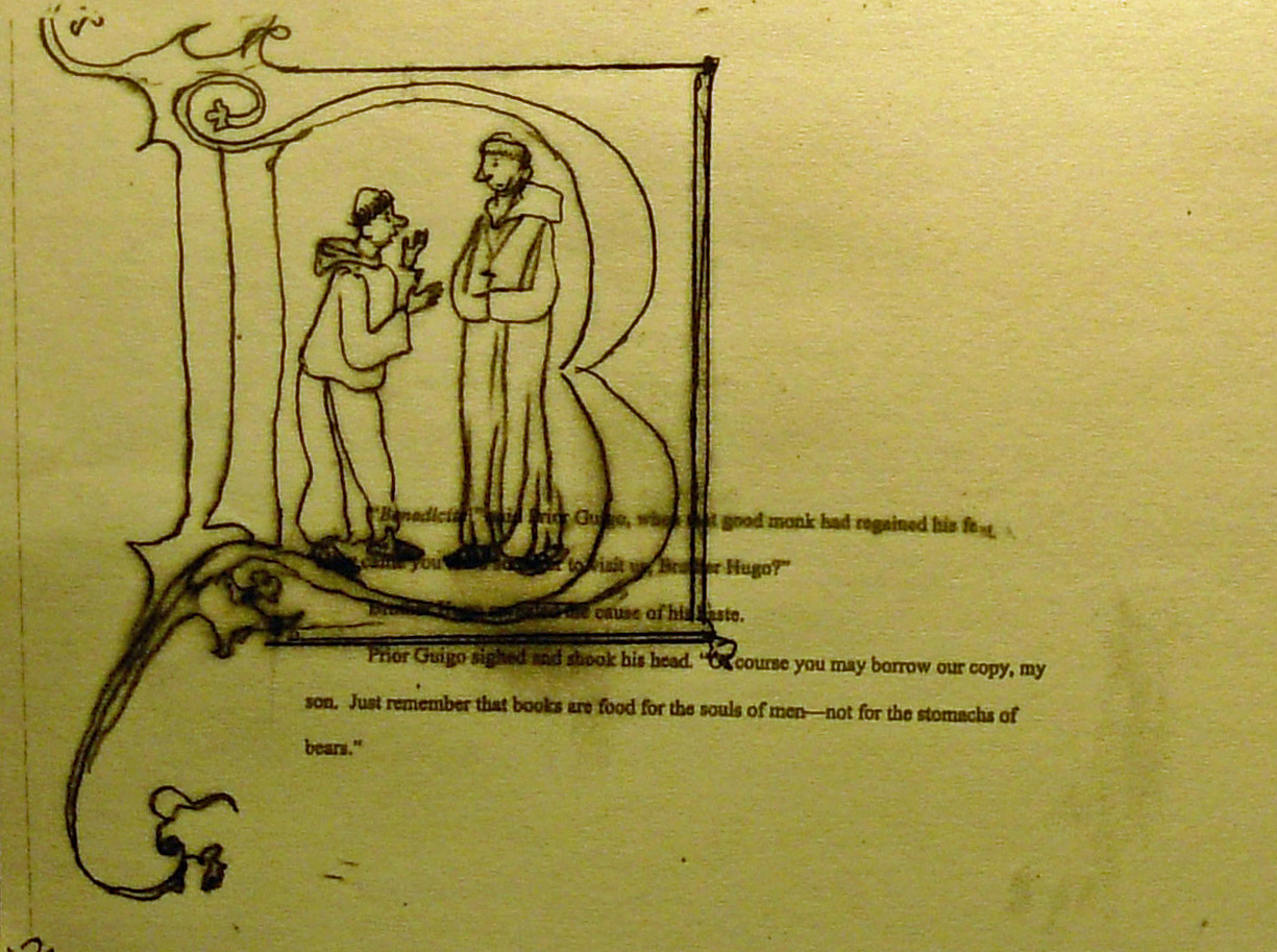
Two vignettes, one on the upper left, the other on the lower right. This helps to separate the two scenes. I add a big honking capital letter to start each text block.
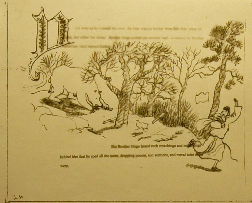
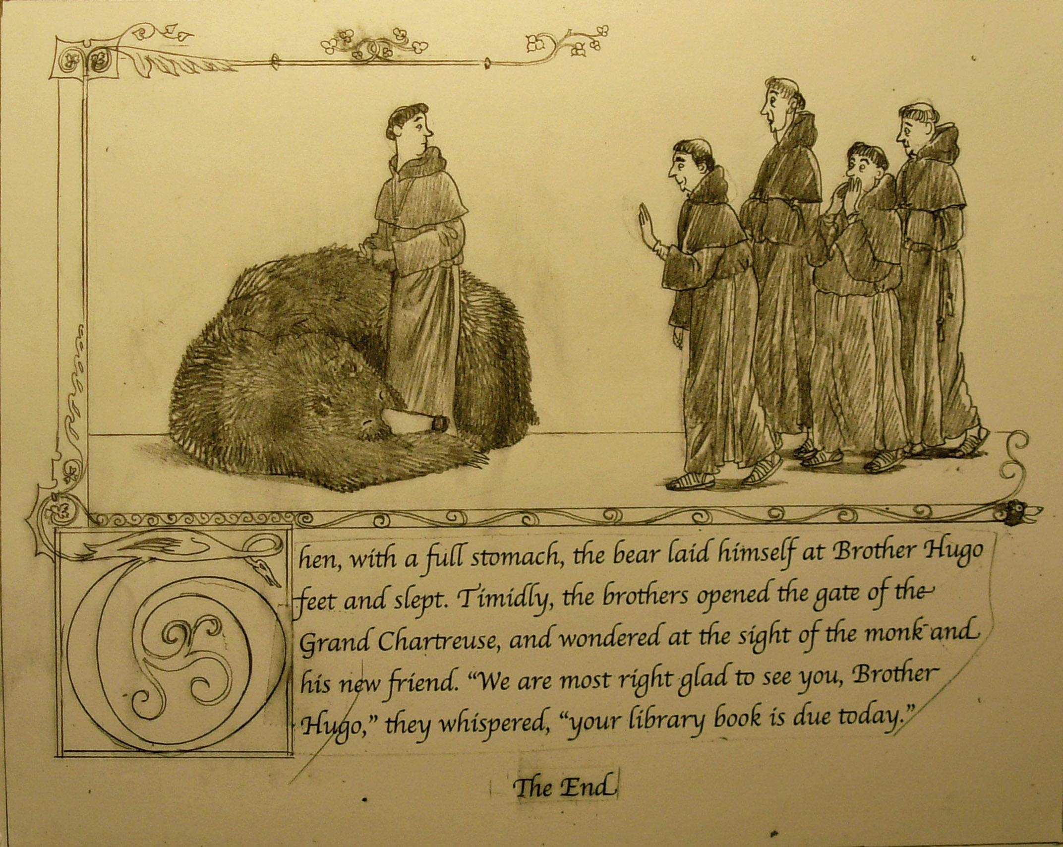
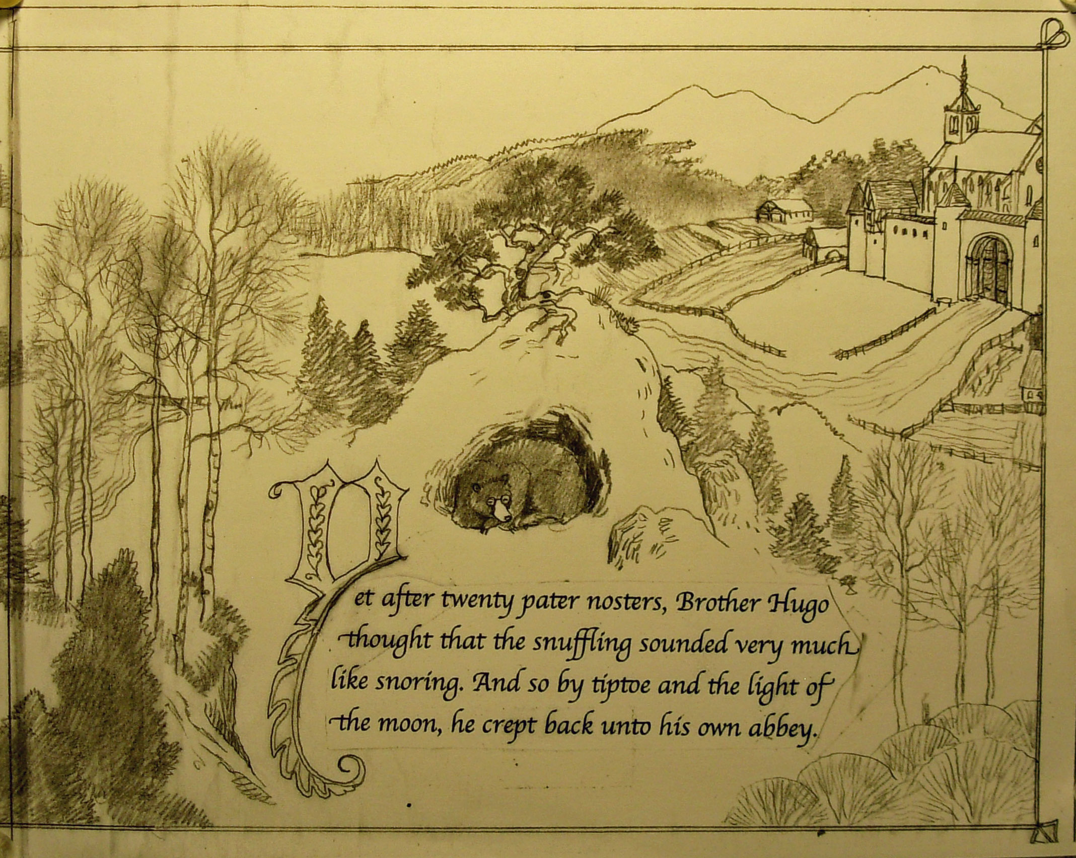
The story ends with the bear asleep, wrapped around Hugo like a big cat. A vertical and horizontal banner connect to the boxed big “T” and slightly enclose the scene. The monks approach the bear timidly. There will be more spreads to do. The book will end with an author’s note, an illustrator’s note, a historical note and also a glossary.
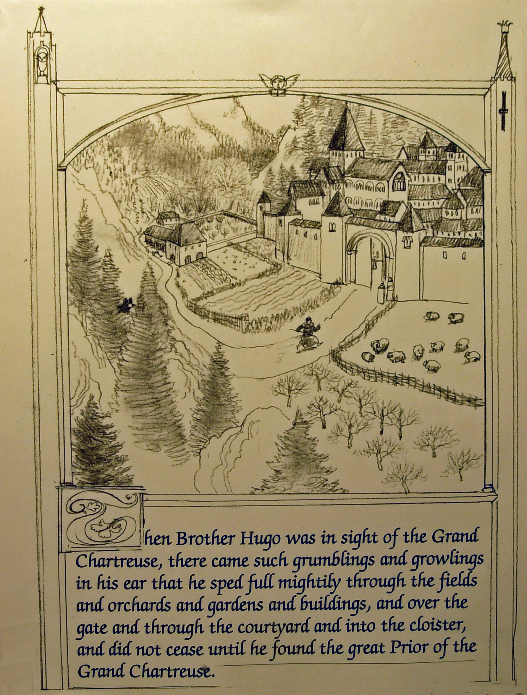
Thumbnails-12
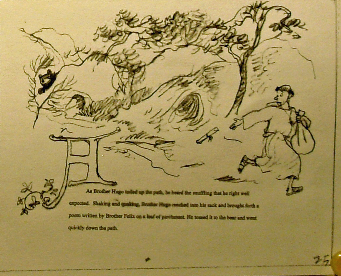
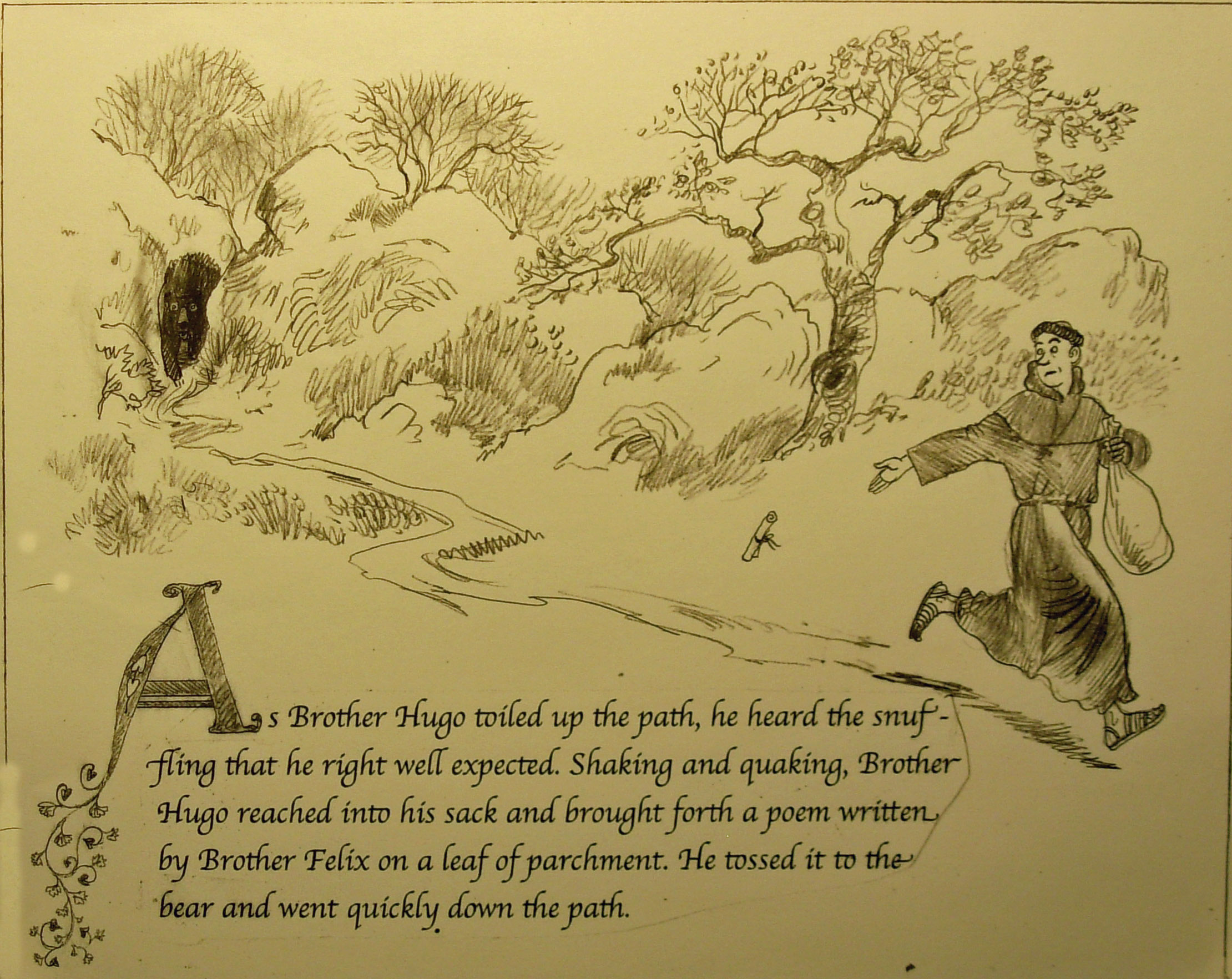
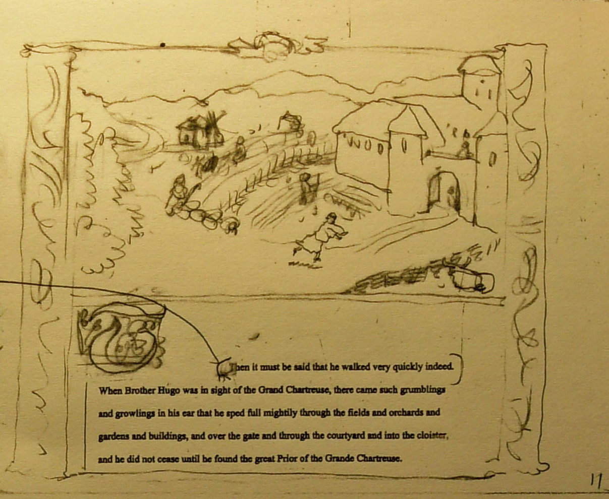
The bear is closing in and Hugo is running out of extra writings. The righthand page shows Hugo sprinting across the top with the bear at his heals. A horizontal banner separates the top drawing from the text and lower scene.
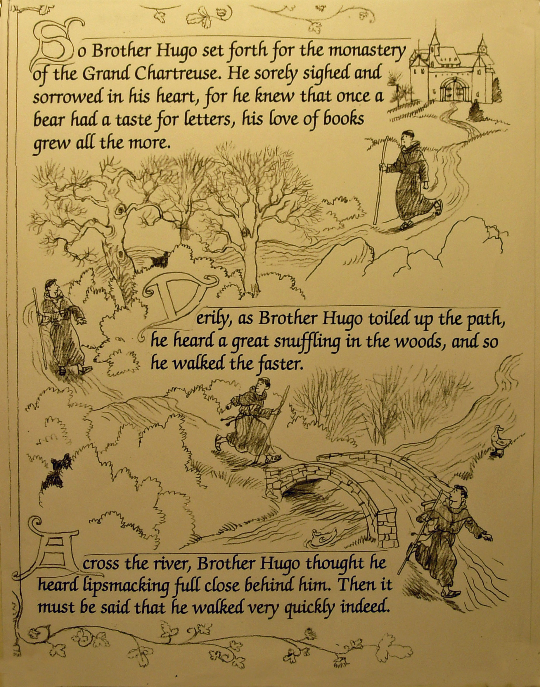
Thumbnail-11
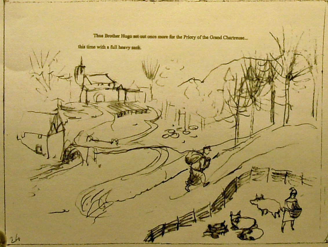
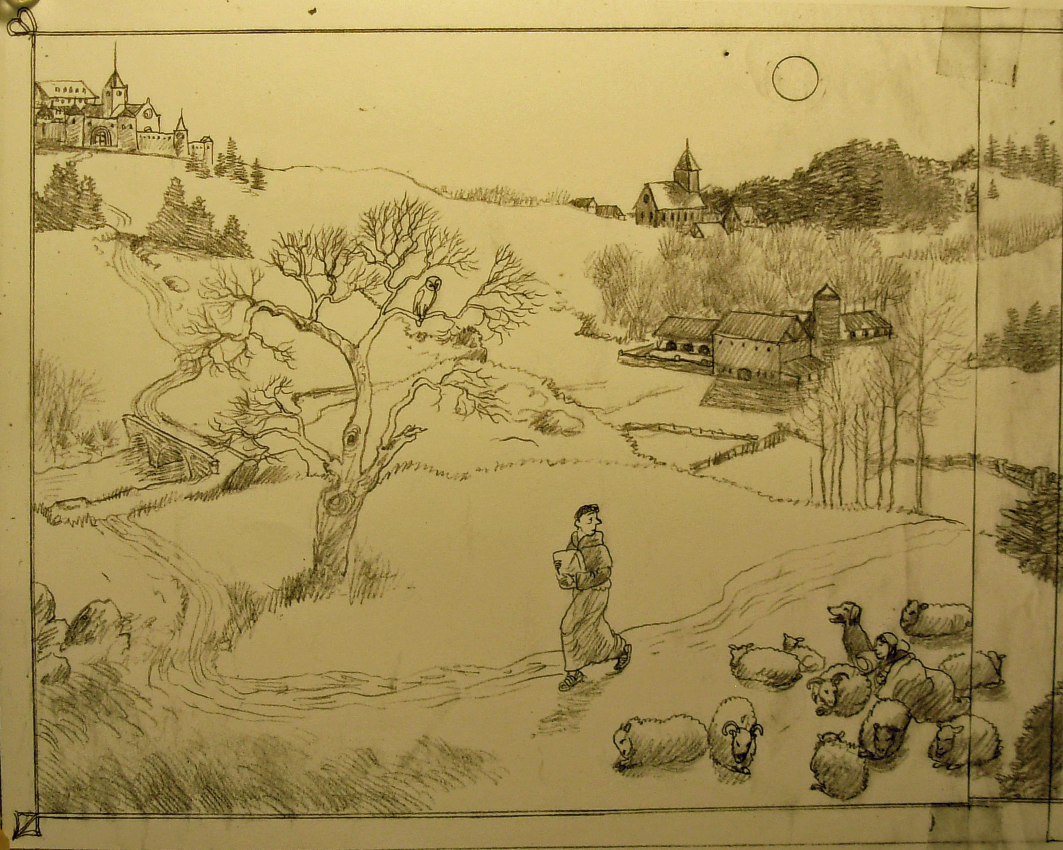
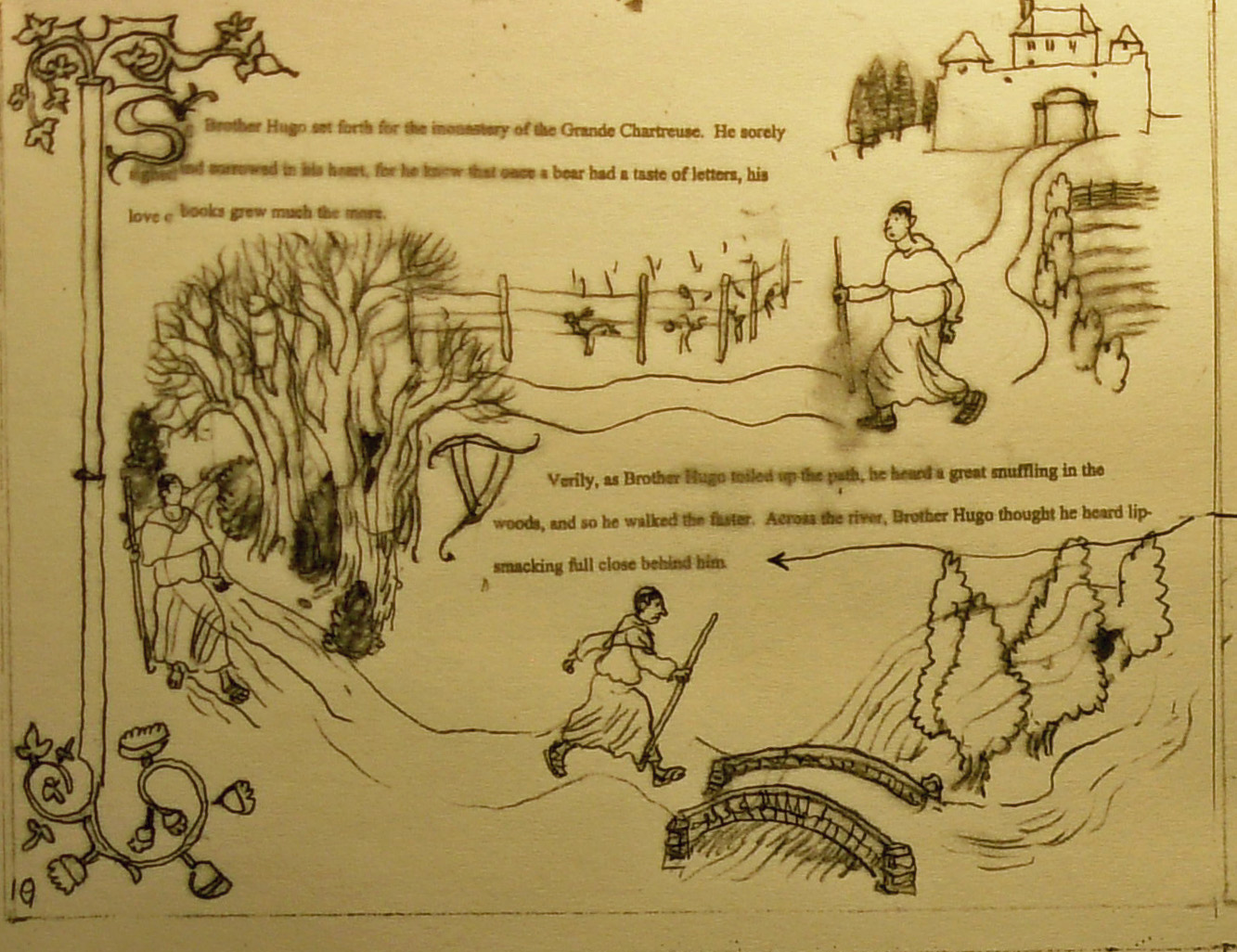
The trip back begins and will continue through the next spread. The landscape becomes wilder and more hilly as Hugo gets farther from his own monastery. The pace picks up.